| Author | Thread |
Comments Made During the Challenge  |
|
|
10/13/2002 11:24:00 AM |
Composition: Subject Placement, Cropping, Background6,
Technical: Focus, Exposure, Lighting, Processing8,
Appeal: Is it Interesting, Motivating, Etc.? 4,
Total Averaged Rating6. Autool
|
|
|
|
10/13/2002 06:10:00 AM |
|
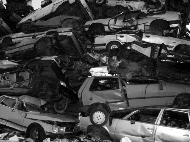
Interesting subject. I like how all the trashed cars are stacked up. The lighting looks a bit shallow and boring. I don't know the original image but you probably chose black&white for a reason. However, it only makes it look more flat in this case. Maybe a different angle? Maybe from a little below to show how tall this stack is? Just an idea. Also to me the photo looks a bit unsharp. Maybe a little postprocessing (sharpening is allowed) could have helped that. -stephan |
|
|
|
10/10/2002 04:40:00 PM |
|
|
|
10/09/2002 10:46:00 PM |
|
I'm not sure b/w was a good choice here. |
|
|
|
10/09/2002 06:59:00 PM |
|
|
|
10/08/2002 08:55:00 PM |
|
What a frightening place! |
|
|
|
10/08/2002 05:48:00 PM |
|
now thats a pile of cars!! nice comp. 8--shutterfly |
|
|
|
10/08/2002 05:42:00 AM |
|
Jeez, what happens to all that trash? I guess it just takes up space for thousands of years. This is a perfect example of human waste. Great pic! |
|
|
|
10/07/2002 10:58:00 PM |
good photo but doesn't look like garbage to me
|
|
|
|
10/07/2002 10:39:00 PM |
|
THIS HAPPENED TO MY CAR THIS WEEK. I am so sad. :( |
|
|
|
10/07/2002 10:21:00 PM |
|
I am not too impressed with the actual photography. The crop is questionable, but the idea is fantastic. 8/10 |
|
|
|
10/07/2002 06:56:00 PM |
|
This one I think I would like better in color. Cool shot, though. |
|
|
|
10/07/2002 12:30:00 PM |
|
Wow, pretty stacked up there. I usually like B & W but wonder how colorful this would have been in color. A bit soft on the focus. DPz |
|
|
|
10/07/2002 11:31:00 AM |
|
did you use a flash here? for stuff like this, where there are small reflective light sources, i like to use a long exposure and a tripod. this is nice, though, that's not a criticism. |
|
|
|
10/07/2002 09:35:00 AM |
|
Great shot… I think colour would have worked better, but I still think this is a good shot. (8) |
|
|
|
10/07/2002 02:03:00 AM |
Technically correct , exposure, focus, saturation , contrast.5
Good composition. 4
Tells a story or creates a mood 5
Impact to the viewer 4 would have made more of an impact in colour
Relevance to the Challenge 6
Overall 5
sulamk
|
|
Home -
Challenges -
Community -
League -
Photos -
Cameras -
Lenses -
Learn -
Help -
Terms of Use -
Privacy -
Top ^
DPChallenge, and website content and design, Copyright © 2001-2026 Challenging Technologies, LLC.
All digital photo copyrights belong to the photographers and may not be used without permission.
Current Server Time: 06/28/2026 11:23:07 PM EDT.