| Author | Thread |
|
|
08/19/2008 10:16:26 PM |
|
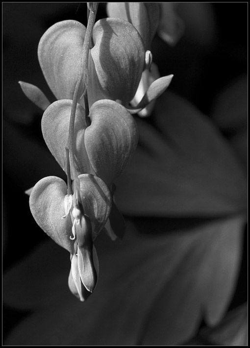
This has a lot going for it, starting with the high contrast up front that leads my eye up the flower and back down the background. The composition isn't awkward at all and really works for this photo, more in the B&W than the color. |
|
 Photographer found comment helpful. Photographer found comment helpful. |
|
|
06/03/2008 12:25:36 AM |
|
Nice detail and dof. I do find the composition a a bit cramped on the left and feel that maybe it would seem more balanced had the negative space been on the other side. Still a nice shot of a beautiful flower. |
|
| Photographer found comment helpful. |
|
|
05/27/2008 08:56:53 PM |
|
hmm i think the bw brings out a delicate and fragile feel to the flowers, like you have to be quiet when viewing it |
|
| Photographer found comment helpful. |
|
|
05/25/2008 03:56:13 PM |
|
interesting image, the colors are so wonderful, the B&W does not do it justice. |
|
| Photographer found comment helpful. |
|
|
05/25/2008 01:41:39 PM |
|
ah-ha so these are bleeding hearts! My mom has been going on about how they are her favorite flowers but I've never seen them before. As for the composition, I think you did the best you did with the angle you had. the only thing I would suggest is that if there was originally some space on the right I would leave most of that there while keeping the crop on the right the same so that you end up with a more horizontal than verticle image. |
|
| Photographer found comment helpful. |
|
|
05/23/2008 12:24:56 PM |
|
The picture is nice, but you are right, there is something that doesn't feel "right" about it. Perhaps it would be more pleasing if the blooms were at an angle through the image. It is almost as if there is too much room to the right. |
|
| Photographer found comment helpful. |
|
|
05/23/2008 09:12:14 AM |
Hmmmmm. I get your meaning on the composition -- it does strike me as a bit awkward. Not quite sure why. These things do grow down... Maybe if there was a little more background to the left of the flowers. Or maybe you could have angled the flowers to come at a diagonal out of the corner???? But that's not how they grow, is it.
I just did a quick scroll down so that I just had the bottom flower in the picture, and I think I like that composition better, but then I really don't like portrait orientation very much under any circumstances.
I guess I go with giving it a more space on the left hand side.
Aside from that I love the tones and texture and that bokeh is perfect. I like the b&w better than the color version FWIW. |
|
| Photographer found comment helpful. |
|
|
05/23/2008 05:14:38 AM |
|
Beautiful design - darker bg of leaf in faint dof I think contributes place & environ to this natural repeating arrangement. Very good edit. |
|
| Photographer found comment helpful. |
|
|
05/23/2008 01:41:37 AM |
|
WOW - you've made them luminous! Lovely. |
|
| Photographer found comment helpful. |
Home -
Challenges -
Community -
League -
Photos -
Cameras -
Lenses -
Learn -
Help -
Terms of Use -
Privacy -
Top ^
DPChallenge, and website content and design, Copyright © 2001-2026 Challenging Technologies, LLC.
All digital photo copyrights belong to the photographers and may not be used without permission.
Current Server Time: 06/30/2026 06:51:37 PM EDT.