| Author | Thread |
Comments Made During the Challenge  |
|
|
05/20/2008 01:27:00 PM |
|
|
|
05/20/2008 10:03:29 AM |
|
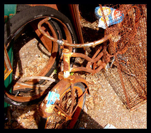
Too bright, and is seems to have a rigid sharpness the dirupts the actual texture of the rust. |
|
|
|
05/20/2008 12:03:19 AM |
But it was well loved at one time.
Seems perhaps a touch oversaturated, and your image size is much smaller than was allowed for this challenge. It's a good idea to always have your long dimension as large as allowed, for maximum visible detail. |
|
|
|
05/19/2008 10:06:33 PM |
|
I like the different colors in this picture. |
|
|
|
05/19/2008 03:21:14 PM |
|
There is way too much going on in this picture. My eyes are all over the place and it's hard to focus on the bike because it blends in with everything else. Try removing or isolating the subject from it's background in other ways. Also the shadows on the image makes me think that you just walked out back snapped a shot and came back in and entered it just to have something to enter. Sorry but it's the way this image talks to me. |
|
|
|
05/19/2008 09:51:54 AM |
|
id like to see more contrast |
|
|
|
05/16/2008 06:36:49 PM |
|
that's a rusty peice of bycicle...;) 8 |
|
|
|
05/16/2008 09:11:09 AM |
|
Picture needs to be larger. Also, IMNSHO, the black border is a distraction. |
|
|
|
05/15/2008 07:24:10 PM |
|
I think if you wouldve pulled the bike out in a shot by itself this pic wouldve worked better... |
|
|
|
05/15/2008 03:53:52 PM |
|
|
|
05/15/2008 09:58:43 AM |
|
nice photo but i don't like how everything in the photo is rusted. it puts a single tonality over the whole photo and makes it kind of boring |
|
|
|
05/14/2008 09:54:46 PM |
|
I like the title, very clever. Can't say I'm crazy about the image though. |
|
|
|
05/14/2008 02:55:09 PM |
|
Nice pun. Don't like the shadow in the bottom left. It might be you, it might have been better taken at a different time of the day when the sun is in a different spot.... or moving the bike (if it isn't rusted to the ground) |
|
|
|
05/14/2008 09:31:45 AM |
|
great angle for challenge |
|
|
|
05/14/2008 09:27:32 AM |
|
I like the countinuity of the rusty colorthe blue i find to be distracting and too scattered in its placement. |
|
|
|
05/14/2008 01:20:57 AM |
|
Suc contrasting colors in this photo... the seat jumps right out. |
|
Home -
Challenges -
Community -
League -
Photos -
Cameras -
Lenses -
Learn -
Help -
Terms of Use -
Privacy -
Top ^
DPChallenge, and website content and design, Copyright © 2001-2026 Challenging Technologies, LLC.
All digital photo copyrights belong to the photographers and may not be used without permission.
Current Server Time: 06/27/2026 04:23:42 PM EDT.