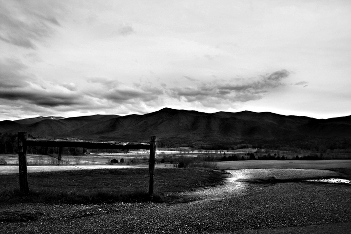
Hmn. My own images tend to be too dark; but I think dahkota has something here, not just for DPC voters: possibly not quite midway between the two, darker than lighter, so that we can still be hit by the nice flowing compositional light lines in the foreground.
What I think is missing in your image is midtones. If you look at the histogram, you have a lot of darks and a lot of lights, but not much in between. that works, in this case, to keep people out of the image. I pulled the image into photoshop and did a quick shadow/highlight to strengthen the midtones. It may not be what you were after, but I think it would have scored higher with the DPC voters. Image
A pretty landscape but hard to see all the detail in mountains and clouds without tipping my monitor back and forth. This may be a problem with my monitor.
The backlighting is hiding some of the details of the mountain that my eye is trying to see. I find it good though not great. I suspect this will have a lot of appeal to some other folks, however.





 Add photograph to your favorites
 Add photographer to your favorites

 Photographer found comment helpful.


