| Author | Thread |
|
|
05/13/2008 02:34:15 PM |
Critique Club Greetings
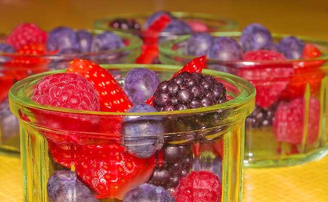
Hi, I think that this is a good idea but with a very bad realization. The most important problem that I see (always as my personal opinion) is the light. too much on the fruits and too much strong. the colours aren't very good, not natural but this is a consequence of the light.
from compositional point of view is good.
Gennaro
P.S. if you have something to ask me please send me a personal message. |
|
 Photographer found comment helpful. Photographer found comment helpful. |
Comments Made During the Challenge  |
|
|
05/06/2008 11:59:35 PM |
|
Whetting the appetite scale: 6 |
|
| Photographer found comment helpful. |
|
|
05/06/2008 05:26:24 PM |
|
Nice choice of complementary colours...and I like your perspective. |
|
| Photographer found comment helpful. |
|
|
05/04/2008 08:28:19 AM |
|
very colorful and inviting |
|
| Photographer found comment helpful. |
|
|
05/02/2008 12:43:51 AM |
|
Nice composition, but the light is kind of harsh |
|
| Photographer found comment helpful. |
|
|
05/01/2008 09:07:40 PM |
|
composition is very nice, but the lighting has a "neon" feel to it |
|
| Photographer found comment helpful. |
|
|
05/01/2008 07:52:12 PM |
|
seems a bit overexposed to me. No doubt it's healthy though. Also seems like the berries are obscured too much by the dishes. I like the shallow dof and the dishes in the background. Would also like to have seen them arranged in a row diagonally. |
|
| Photographer found comment helpful. |
|
|
05/01/2008 12:05:14 PM |
|
with such colurful fruit one jar on a white or black background would work better. |
|
| Photographer found comment helpful. |
|
|
05/01/2008 09:40:44 AM |
|
| Photographer found comment helpful. |
|
|
04/30/2008 05:24:08 PM |
|
| Photographer found comment helpful. |
|
|
04/30/2008 04:03:22 PM |
|
There is something inherently unhealthy about the yellow tint in the ramekins |
|
| Photographer found comment helpful. |
|
|
04/30/2008 03:08:49 PM |
|
color on the berries seems washed out, the yellow is distracting. whatever lighting you used just didnt give your subjects justice |
|
| Photographer found comment helpful. |
|
|
04/30/2008 01:58:11 PM |
|
I love the combinations of red and violet. :) xxx. |
|
| Photographer found comment helpful. |
|
|
04/30/2008 01:35:47 PM |
|
I like the subject/food choice overall. The yellow tint of the bg is killing this for me. The clear dishes with a white (heck, I'd even try black just to see) bg might be more appealing. All JMO of course. :-) Good luck in the challenge. |
|
| Photographer found comment helpful. |
|
|
04/30/2008 08:16:30 AM |
|
good focus and composition. had filled the cups a bit higher, though. overall a bit bright |
|
| Photographer found comment helpful. |
|
|
04/30/2008 02:11:14 AM |
|
Beautiful --- but colors look surreal. |
|
| Photographer found comment helpful. |
Home -
Challenges -
Community -
League -
Photos -
Cameras -
Lenses -
Learn -
Help -
Terms of Use -
Privacy -
Top ^
DPChallenge, and website content and design, Copyright © 2001-2026 Challenging Technologies, LLC.
All digital photo copyrights belong to the photographers and may not be used without permission.
Current Server Time: 06/29/2026 01:24:40 PM EDT.