| Author | Thread |
|
|
05/07/2008 03:58:38 AM |
|
I really liked this one, great shot. love the angle, the colors, everything, great job :D |
|
 Photographer found comment helpful. Photographer found comment helpful. |
Comments Made During the Challenge  |
|
|
05/06/2008 09:08:44 PM |
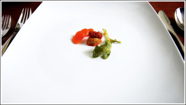
A very good shot!
I think this is my favorite so far.
Great color focus and the concept actually made me laugh.
It's like elf food.... |
|
| Photographer found comment helpful. |
|
|
05/05/2008 11:37:31 PM |
|
Nice and clean. No distractions. I like it a lot. Just a little more light on the table, above the forks to make it more like the other side would of been nice.9 from me |
|
| Photographer found comment helpful. |
|
|
05/05/2008 08:29:45 PM |
|
Portion control does work health-wise for some. |
|
| Photographer found comment helpful. |
|
|
05/04/2008 01:01:05 PM |
|
I've been to restaurants with serving sizes about this size. Funny. |
|
| Photographer found comment helpful. |
|
|
05/04/2008 08:49:53 AM |
|
Utensils seem to be in perfect focus but the food seems slightly OOf, meets challenge nicely though |
|
| Photographer found comment helpful. |
|
|
05/04/2008 12:13:00 AM |
I floss things bigger then that. :)
Nice composition and colors. |
|
| Photographer found comment helpful. |
|
|
05/03/2008 06:14:50 PM |
|
Not voting just commenting. I like the minimalist approach, but the glimpses of the utensils are actually so interesting they disrupt the main presentation. |
|
| Photographer found comment helpful. |
|
|
05/02/2008 05:04:11 PM |
|
| Photographer found comment helpful. |
|
|
05/02/2008 12:39:30 PM |
|
Ha, I've been to restaurants that serve serving like this! Neat photo though! |
|
| Photographer found comment helpful. |
|
|
05/02/2008 08:56:47 AM |
|
Is this supposed to be a joke on expensive food? Nice use of perspective |
|
| Photographer found comment helpful. |
|
|
05/02/2008 07:42:04 AM |
|
Yeah it's healthy, but it doesn't really look that delicious. I think the only way this would appear in a magazine is as a joke. Photowise i would say this has a nice balance to it and a great use of color to add emphasis. the silverware, with their hotspots, is a bit distracting and out of place. |
|
| Photographer found comment helpful. |
|
|
05/02/2008 03:14:34 AM |
|
| Photographer found comment helpful. |
|
|
05/01/2008 09:17:04 PM |
|
| Photographer found comment helpful. |
|
|
05/01/2008 07:03:41 PM |
|
| Photographer found comment helpful. |
|
|
05/01/2008 11:50:18 AM |
|
I feel there is just too much white expanse here! |
|
| Photographer found comment helpful. |
|
|
05/01/2008 10:09:03 AM |
|
YEP- this I could definatly see in a magazine ! (I think i -have- seen something like this *LOL*) nicely done-- very high score! :) love the shapes ;) and simplicity :) |
|
| Photographer found comment helpful. |
|
|
05/01/2008 09:33:49 AM |
|
how you left the silverware just a little visible was a really good choice. it helps make the plate look even larger then how it already is |
|
| Photographer found comment helpful. |
|
|
04/30/2008 09:33:07 PM |
|
Not healthy to eat that little! However interesting compo. |
|
| Photographer found comment helpful. |
|
|
04/30/2008 05:23:53 PM |
|
Very minimalist. I can dig it. |
|
| Photographer found comment helpful. |
|
|
04/30/2008 04:22:39 PM |
|
lol, very good, an extra point for making me laugh |
|
| Photographer found comment helpful. |
|
|
04/30/2008 08:38:26 AM |
|
would work much better with a less centered composition. reds are oversaturated, there's no more texture visible in the carrot slices |
|
| Photographer found comment helpful. |
|
|
04/30/2008 04:40:33 AM |
|
An interesting perspective and great light - 10 |
|
| Photographer found comment helpful. |
|
|
04/30/2008 12:36:51 AM |
|
LOL...that's funny! That will cost you $40 in some restaurants |
|
| Photographer found comment helpful. |
|
|
04/30/2008 12:22:00 AM |
|
| Photographer found comment helpful. |
Home -
Challenges -
Community -
League -
Photos -
Cameras -
Lenses -
Learn -
Help -
Terms of Use -
Privacy -
Top ^
DPChallenge, and website content and design, Copyright © 2001-2026 Challenging Technologies, LLC.
All digital photo copyrights belong to the photographers and may not be used without permission.
Current Server Time: 06/28/2026 11:12:10 PM EDT.