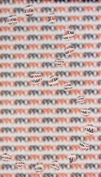
I really struggled getting all the water droplets perfect....so I gave up and figured that there can be some "odd" ones. I'm afraid that I will get docked on scoring for all of the negative space.
Post Processing:
Crop
Contrast
Curves
Resize for web
Statistics
Place: 86 out of 169 Avg (all users): 5.3851 Avg (commenters): 6.1667 Avg (participants): 5.4400 Avg (non-participants): 5.3604 Views since voting: 765 Views during voting: 253 Votes: 161 Comments: 7 Favorites: 0
This has been mentioned before but I'll reiterate anyways. I think the only problem with this shot is the lack of separation between the drops forming the three and the background. Perhaps larger drops might have helped. One thing I did pick up on which I appreciate is that you printed the background backwards so that the words would be mirrored in the drops and therefore display correctly. I also agree that a shallower DOF would have helped. (I wonder how it would have turned out at f/2.8?)
nice use of droplets to create the focus lenses for the shot - the only issue i see is that the 3 itself is not separated enough from the oof background
Cute -- A little contrived, but very powerful. It took me a while to figure out what "PPO" stood for (Doh!). Did you try a lower case "O", then "PPo" may have been more apparent as the inverse "odd"?






 Add photograph to your favorites
 Add photographer to your favorites

 Photographer found comment helpful.


