| Author | Thread |
Comments Made During the Challenge  |
|
|
04/03/2004 01:48:27 PM |
|
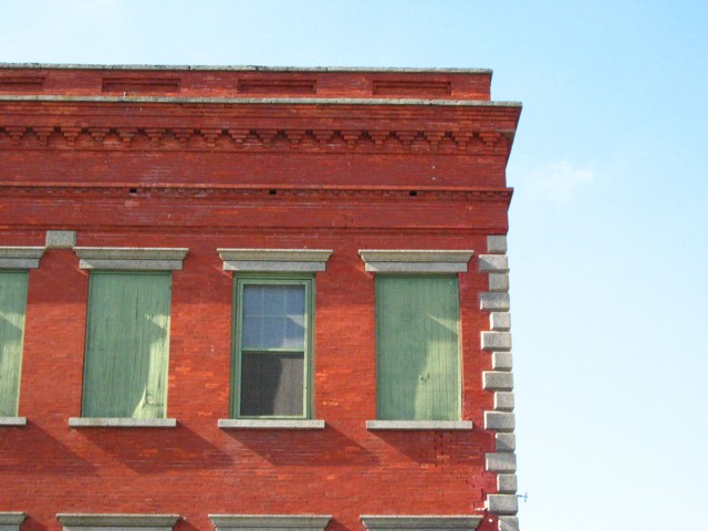
An interesting idea--it could perhaps be improved by a slight perspective adjustment, some added contrast, and maybe adjusting the light for a less washed-out sky (especially bottom right) |
|
|
|
04/03/2004 10:06:19 AM |
|
IMO, I might have cropped this a little differntly with less or no sky and more window, but that is one person's opinion. |
|
 Photographer found comment helpful. Photographer found comment helpful. |
|
|
04/02/2004 09:26:17 PM |
|
Very artisit. Little soft of the focusing. I have to wonder how this looks in black and white..I would think very good. |
|
|
|
04/02/2004 01:57:25 PM |
|
Great idea., but something doesn't work (IMHO). Building slopes downard to the right. Sharper focus needed? Giving it a 5 but wanted to give it a 7! |
|
|
|
04/02/2004 08:02:47 AM |
|
great color combination -- wondering what this would look like with a portrait orientation -- minor nits: I'd clone out the bluish thing on the side of the building lower right and crop out the window frames on the floor below |
|
| Photographer found comment helpful. |
|
|
04/01/2004 05:31:57 AM |
|
Slightly tilting. A tiny rotation might have fixed it. |
|
Home -
Challenges -
Community -
League -
Photos -
Cameras -
Lenses -
Learn -
Help -
Terms of Use -
Privacy -
Top ^
DPChallenge, and website content and design, Copyright © 2001-2026 Challenging Technologies, LLC.
All digital photo copyrights belong to the photographers and may not be used without permission.
Current Server Time: 06/28/2026 07:16:16 PM EDT.