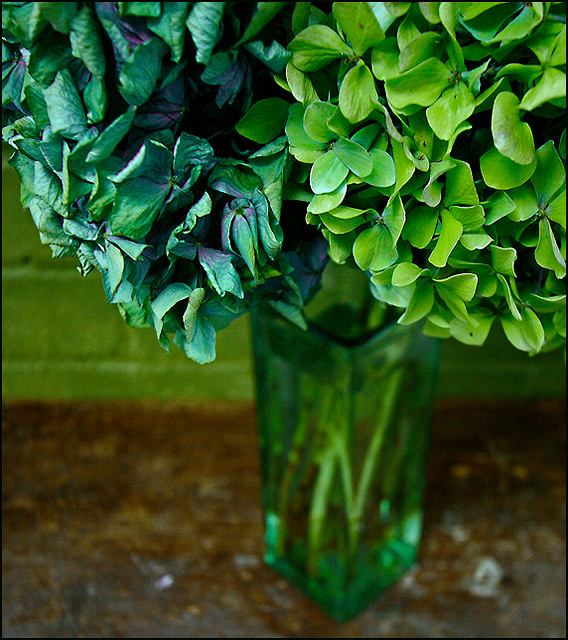
I like the difference between the greens on the right and the more aquamarines (with a hint of purple) on the left, similarly the life and vibrancy on the right compared to what looks like dryness and a touch of decay on the left
To be honest I might have prefered a tighter crop at the bottom at the 'horizon' where the table meets the wall (which is another cool green.
a little too much is out of focus here, a little over half, and i find that to be distracting. But the coors and subject itself is beautiful and i like how you were able to get a nice range of hues in that blue/ green color.





 Add photograph to your favorites
 Add photographer to your favorites

 Photographer found comment helpful.


