| Author | Thread |
Comments Made During the Challenge  |
|
|
04/01/2008 07:31:47 PM |
|
|
|
03/31/2008 08:17:22 AM |
|
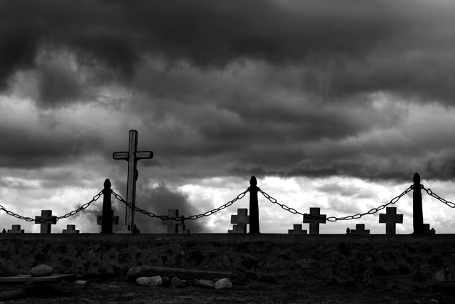
This is a very nice shot. I like how the clouds are over the shot making it look very dark but i like how the pattern is the crosses |
|
 Photographer found comment helpful. Photographer found comment helpful. |
|
|
03/29/2008 12:32:21 PM |
|
I'm assuming the pattern is that of the grave markers. The fence in the foreground is pulling my attention (maybe the fence is the pattern.) That being said, there is so much dark sky that it overwhelms this shot, the angle of shot obscures the markers and the dof brings everything forward. Again, those are criticisms if the markers are your subject. If the fence is the subject...the sky overwhelms, the markers demand too much attention...maybe they shouldn't be there at all. If the sky is your subject, I think perhaps this should be in a different challenge all together. ;) |
|
| Photographer found comment helpful. |
|
|
03/28/2008 12:10:12 PM |
|
great stormy sky behind reall adds to the impact here, and the chain adds another pattern. 8 |
|
| Photographer found comment helpful. |
|
|
03/27/2008 10:04:22 PM |
|
emotive, creepy, well done. |
|
| Photographer found comment helpful. |
|
|
03/27/2008 05:04:45 PM |
|
This one is a touch too dark, BUT I like it because it has the pattern of all the crosses, as well as a more subtle pattern -- the pattern of the cycle of life. Or maybe you just thought it was a cool sky and I'm reading too much into it. :) Still a neat shot. |
|
| Photographer found comment helpful. |
|
|
03/27/2008 06:09:46 AM |
|
Dark & grim which I am sure that was what you wanted to potray in this image. I would have liked an even more extreme angle of view to emphasise the patterns. 6 |
|
| Photographer found comment helpful. |
|
|
03/27/2008 12:01:00 AM |
|
like the B&W, but image is so dark.... a higher up view might have gotten more 'repeating' crosses?? |
|
| Photographer found comment helpful. |
|
|
03/26/2008 10:50:06 AM |
|
I like how you seem to have two patterns going on but they are both in the middle. It creates a lot of negative space. The sky is nice I think the photo would look better without some of it though... |
|
| Photographer found comment helpful. |
|
|
03/26/2008 09:33:24 AM |
|
i would say its a little to dark, but thats kind of the theme of this photo so it works well here, good job. |
|
| Photographer found comment helpful. |
Home -
Challenges -
Community -
League -
Photos -
Cameras -
Lenses -
Learn -
Help -
Terms of Use -
Privacy -
Top ^
DPChallenge, and website content and design, Copyright © 2001-2026 Challenging Technologies, LLC.
All digital photo copyrights belong to the photographers and may not be used without permission.
Current Server Time: 07/02/2026 05:15:49 PM EDT.