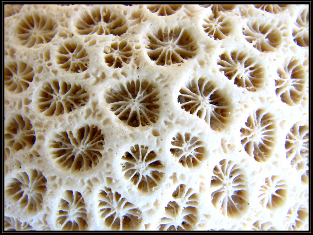
I feel as if the lighting is too harsh. Could you have cropped out the brightest area and then left everything else? The shading is very nice, but not in balance with the lower right corner.
Lost a little highlight detail over in the corner, but it's not like that has not been the case on much of my own stuff. This is neat looking. At first glance, I almost thought it was an odd kind of cheese.
Not bad, but I think it needs a little side light to make it look a little more 3D. Also, it looks a little over exposed as the whites in the lower right look pretty blown out.
Definitely follows the the theme of this challenge. Seems to be a bit over exposed with the blown out area on the right more a distraction than a complement to the shot.






 Add photograph to your favorites
 Add photographer to your favorites


