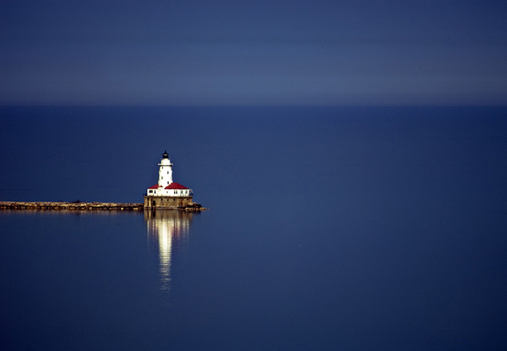
Nice use of the negative space, but I think you should have cropped it a little lower int he frame. It just seems a little awkward to me where it is in the frame.
I really like this pic, but I wish maybe the lighthouse were just a bit more crisp. I love the setup of the shot though and the overall image really catches my eye. I think you may be on to something here.







 Add photograph to your favorites
 Add photographer to your favorites


 Photographer found comment helpful.


