Author Thread Comments Made During the Challenge
Post actions
Post actions
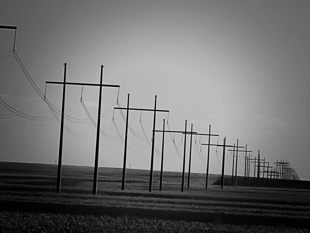
A good shot, but the dark around the edges is a little annoying.
Post actions
I like that you put this in black and white. I think it adds a lot of value in the picture.
Post actions
Would like to see this on a straight horizontal.
Post actions
the lines in this photo define the positive characteristics of this image.
Post actions
I think this will do better if you straighten up the horizon
Post actions
Great idea, but it would work better if the horizon was straight.
Post actions
nice shot i think making then horizon strait would give a little bit more to this photo but i love the b/w nice job.
Post actions
Post actions
This reminds me of drives to my Grandparent's home in a very stark area of Kansas. Lovely conversion and great lines.
Post actions
Prefer a leveled horizon, this would also correct the verticals. CRop tighter (do not need so much sky) to emphasize the patterns more
Post actions
Not a lot of interest. Cool pattern, but common, everyday view.
Post actions
I like the vignetting, it adds mood
Post actions
The tilting doesn't look so good here but i like the b & w compo. a lot
Post actions
I wish you had straightened the horizon. Other than that, very nice shot.
Post actions
I like the tilt and the march of the poles into the distancee. 7
Post actions
Good idea for this challenge however I think it would do better if the tilt were either corrected or more deliberate. As it is it just looks like a mistake.
Post actions
I like the choice of black and white. Maybe if the black fade on the sides wasn't there it could be better. good shot






 Add photograph to your favorites
 Add photographer to your favorites


 Photographer found comment helpful.


