Author Thread Comments Made During the Challenge
Post actions
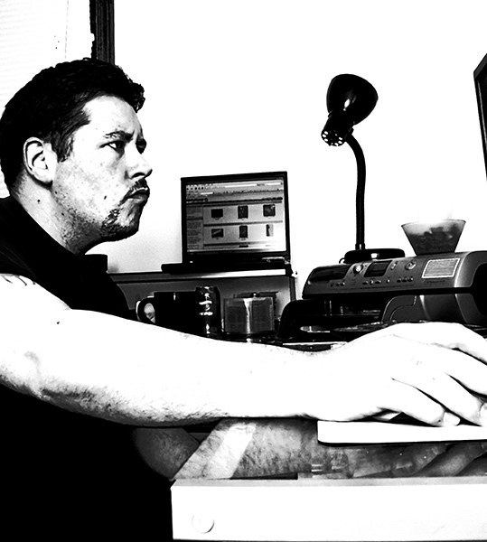
A bit overprocessed for my tastes. Looks almost like a duotone litho print.
Post actions
I don't like the black and white color thing that's going on here and it makes it seem a little odd
Post actions
Everything is too blown out for my tastes. This causes me to not even give things the attention that they deserve. I guess that is why art speaks differently to different people.
Post actions
too much glare, too much profile, not enough sense of place.
Post actions
ohhhhhhhhhhhhh.... really blown out nice try
Post actions
Arm and face and almost completely blown out and I'm not quite sure what he is doing here in his "environment." Either the lighting was harsh or you bumped up the contrast way too much...3
Post actions
Probably would have been better in color. Not digg'n the black n white. Not smooth looking and contrast needed to be adjusted.
Post actions
This almost appears to have a stamp filter effect on it and the processing does give it some artistic merit, but it is awfully harsh in contrast.
Post actions
Far too harsh and mostly blown out. I'm not sure what you were trying for, but the result is not a pleasing portrait.






 Add photograph to your favorites
 Add photographer to your favorites


 Photographer found comment helpful.


