| Author | Thread |
Comments Made During the Challenge  |
|
|
03/25/2008 11:38:54 AM |
|
 Photographer found comment helpful. Photographer found comment helpful. |
|
|
03/22/2008 02:11:25 PM |
|
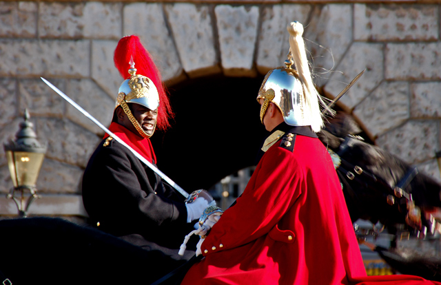
Nice shot with very strong colours and a great moment in time (perhaps moreso than a portrait) capture. I almost feel like saying I wish it was not quite so tight so you could see a tad more of Buck Pal, but if you did open up the image then I have no doubt I would be saying I wish you had gone tighter on the guardsmen, which I guess just goes to prove you are damned if you do and you are damned if you dont |
|
| Photographer found comment helpful. |
|
|
03/21/2008 08:32:03 PM |
|
Love the red. Like the subject matter a lot. This type of shot is very difficult - a moment in passing, and probably a very nice memory. As a photo, the faces of both men are too much in shadow, and the focus of the picture is the man on the right, who is facing away from you. The focus wants to be (I think) on the man on the left, but there you have problems with the bright sun / shadow on his face. I suggest experimenting with a tighter crop that actually loses some of the man on the right, & tighter to the tip of the sword. I can understand wanting to leave the lantern on the left and helmet on the right intact, but you may have to sacrifice that in order to get the most from this shot. |
|
| Photographer found comment helpful. |
|
|
03/20/2008 08:06:08 PM |
|
Very different, love the POV, comp, and expressions and the tossed head of the horse on the right. wish I could hear what was being said! 8 |
|
| Photographer found comment helpful. |
|
|
03/20/2008 07:15:01 AM |
|
typical tourist snapshot; harsh light, contrast is too high, motion blur, uninteresting crop, faces are barely visible. |
|
|
|
03/20/2008 07:02:42 AM |
|
wow sharppppppp can almost see the point of the sword well done |
|
| Photographer found comment helpful. |
|
|
03/19/2008 05:51:51 PM |
|
Not sure why this seems off to me. Composition seems good, coloring seems good, focus could be a weensy bit better, but not off enough to be obvious. I think that what happened here is that the arch in the back suggests framing that could not be achieved with live people doing their thing. It's not like they would pose for a general person with a camera. |
|
| Photographer found comment helpful. |
|
|
03/19/2008 04:41:19 PM |
|
Nice shot. I like the that the subjects are moving in opposite directions and the use of depth of field to focus the eye on the subjects |
|
| Photographer found comment helpful. |
Home -
Challenges -
Community -
League -
Photos -
Cameras -
Lenses -
Learn -
Help -
Terms of Use -
Privacy -
Top ^
DPChallenge, and website content and design, Copyright © 2001-2026 Challenging Technologies, LLC.
All digital photo copyrights belong to the photographers and may not be used without permission.
Current Server Time: 06/30/2026 12:09:30 AM EDT.