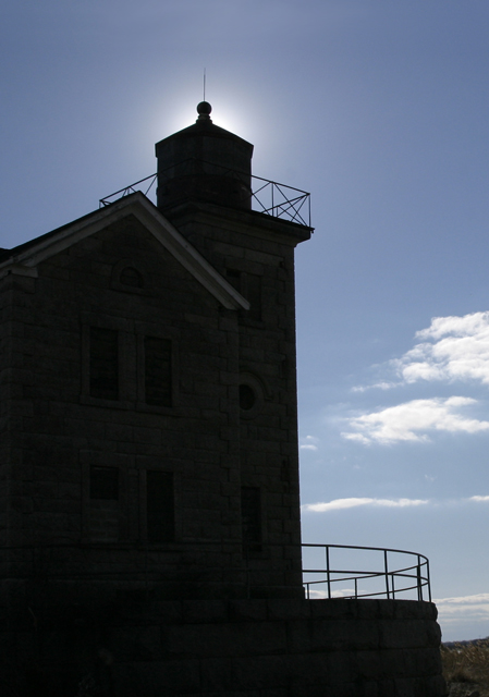
Not sure how to rate this one: as a picture it is great, but as a lighthouse picture I think the foreground should have been more exposed. Atmosphere is great, though.
Nice shot, and a good magazine cover, with a vertical format and space at the top that could carry type without spoiling the picture. I really like the silhouette effect.
Nice composition, and I like the 'halo' at the top of the lighthouse. Plenty of room for type, too. Unfortunately, the building is very dark, but not enough to be an intentional silhouette. I'll bet the shot would have scored 1.5 points higher by darkening the sky and dodging the building in Photoshop.
I can't see this working for a magazine cover about lighthouses and then leaving the lighthouse that dark. This looks like it would be a great shot with the light hitting the face of this building - it looks magnificent.
I like the sun behinf the lighthouse effect, however, the resulting darkness of the subject takes much away. Increasing your aperature and reducing your exposure time will provide more light on the building. Unfortunately, if you overdo it, it can blow out the sky as well. If you get a chance to shoot again at that location, you may want to mess around with different aperatures to see what you can do. Failing that, there's always dodging in photoshop. ;)






 Add photograph to your favorites
 Add photographer to your favorites


 Photographer found comment helpful.


