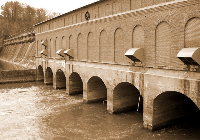
Everyone's favorite magazine about the North American hydroelectric industry....I used levels and unsharp mask, and followed John Setzler's helpful tutorial on creating sepia tones.
Statistics
Place: 114 out of 147 Avg (all users): 5.0056 Avg (commenters): 4.5000 Avg (participants): 4.9659 Avg (non-participants): 5.0435 Views since voting: 1009 Votes: 180 Comments: 6 Favorites: 0
First off I'm not familiar with this magazine so no idea what is normally on the cover or the subjects they write about. Secondly, the use of landscape mode, which I'm sure a magazine layout editor could still use but the composition does suggest a strong wide angle. I personally dont find much interest in the subject presented, but that's not to say that other people wouldnt either. I dont know the limitations you had while shooting, but as a suggestion - it may have been interesting to get a single tunnel/arch thingie and concentrated on that with the water coming through.
Nice level of detail in the foreground, but I think you needed greater depth of field. The foreground water seems a bit overexposed... if you haven't already I would decrease the contrast levels in your camera so you can capture a greater dynamic range and increase the contrast back in Photoshop. The composition seems to lead the eye out of the shot, which is not a good thing here. The eye should be led to a point somewhere in the picture, preferably at one of the thirds junctions. Not quite sure why you went for a sepia look here. The trees in the background take away from your composition. Not sure what you wanted to achieve here in general.
(I'm writing this to everyone who submitted a landscape shot) The challenge was to produce a shot worthy of a magazine cover but to me a shot like this is not suitable to be put on a "portrait" format magazine.
---ADDITIONAL---
Due to forum discussions and accusations that marking landscapes down is nitpicking, I'm going through them and remarking. I still think some of the landscapes would not make good covers because of their orientation but I am no longer marking down because of that.
I still think landscape is inapropriate for the majority of magazines but I'll give the benefit of the doubt to the photographers.






 Add photograph to your favorites
 Add photographer to your favorites


 Photographer found comment helpful.


