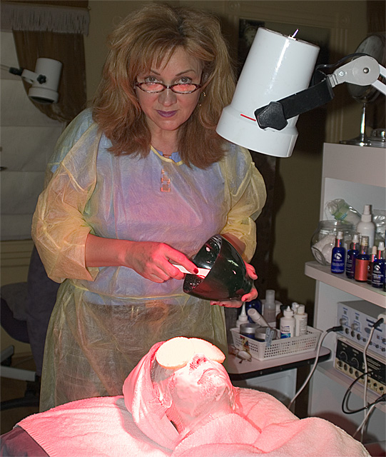
Post Challenge... Wow, all the 1's, 2's and 3's, I wish you'd step up and tell me why. This is as EP as you can get. This was not a staged shot. This person owns this business & the customer was paying $100/hr for this treatment. The pink (special UV lighting, from that light hanging over her head) is a part of this treatment. Shot in a dark room, with the overhead light flicked on to expose (flash washed out the pink).
Statistics
Place: 106 out of 159 Avg (all users): 5.1221 Avg (commenters): 5.9231 Avg (participants): 4.9474 Avg (non-participants): 5.1707 Views since voting: 920 Views during voting: 409 Votes: 262 Comments: 17 Favorites: 0
I didn't vote either but I'll try to give some constructive criticism. Personally I like the composition, especially as an EP. It's clearly a somewhat difficult exposure, limited by the highlights on the client's face...and with Basic ruleset means you're limited in what you can do to address it. I think the main reason for not appealing to voters isn't the composition but the processing (or lack of) but in the colours/sharpness/contrast/tones. As it is, it has a bit of a snapshot feel to it purely because of the colouring I think. Maybe try a small USM (10, 60, 0 is my standard output settings) and play with both levels/curves and selective colour to try to make the image 'pop' a little more. Also worth playing with the aperture to find the right level of ambient and flash light in the scene (if you have the time). You can control the amount of flash or ambient light by varying aperture and in this photo might have given you some extra options to isolate your subjects from the background.
In any case I think this is a better photograph than the score and place suggest, but it does seem that bright colours appeal to DPCers, and muted/washed out colours tend to turn them off.
I didn't vote Kelli, I would have probably given the shot a 5 and I'll try and explain why. I'm honeestly not sure why anyone would give a score less than 4 since the shot is indeed a portrait and an "environmental" shot too. Technically the picture is not too good, with the subject a little flat (contrast-wise). The subject seems a bit soft as well. The major issue is the composition though. Too many competing ideas take the viewer away from the main subject. People tend to be attracted to bright areas first (the white lamp, the patient), areas of lots of contrast (black bowl and white spoon and all the stuff on the shelves), areas of warm color (the patient). The challenge is to make all of this work in the subject's environment, and in this case it's not easy.
Overall I think the idea is good, your engagement with the subject is good but there are things to work on to improve. Hang in there and keep trying, you've definately got a good eye, now it's just hard work.
Oh and btw, this is just my opinion for what it's worth, hopefully this is helpful, but if not just ignore it.
My dad and his wife have a day spa that they're turning over to her daughter, slowly but surely. This is a perfect shot from the perspective of someone who is tangentially familiar with the business. I'm glad your aunt liked it - my dad would display this as well!
I really like this portrait. The ones that have been my favs in this challenge have been those that I didn't need to be led by the title, this among them. One suggestion. your foreground lighting is off and there's a very distracting shaddow the right of your subject, with these two corrections I think this could have been very high on the results page.





 Add photograph to your favorites
 Add photographer to your favorites

 Photographer found comment helpful.


