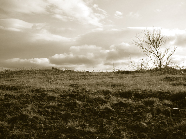
one of my favorite mags. they often publish rather dark images and yes their cover photo is sometimes horizontal...I know I will get a lot of "to dark" "not a cover photo" comments...well for this magasine it is perfect...just go and look it up...
Statistics
Place: 106 out of 147 Avg (all users): 5.1978 Avg (commenters): 5.6250 Avg (participants): 5.0115 Avg (non-participants): 5.3684 Views since voting: 1046 Votes: 182 Comments: 8 Favorites: 1 (view)
Wonderful textures, I especially like the way you've exposed this sky. Impressive range of tones captured here. Centred horizons don't normally look too good, but this works well here, and makes the composition look quite imaginative. The tree on the right makes a great sillhouette.
(I'm writing this to everyone who submitted a landscape shot) The challenge was to produce a shot worthy of a magazine cover but to me a shot like this is not suitable to be put on a "portrait" format magazine.
Nice atmospheric shot though
---ADDITIONAL---
Due to forum discussions and accusations that marking landscapes down is nitpicking, I'm going through them and remarking. I still think some of the landscapes would not make good covers because of their orientation but I am no longer marking down because of that.
I still think landscape is inapropriate for the majority of magazines but I'll give the benefit of the doubt to the photographers.
I haven't heard of many magazines, but I can't really think of that being a magizine title. I think this need a subject. I like the clouds, interesting in sepia.
Wow! This is an awesome shot. This is top quality and pitch perfect. I'm going to give you a high mark; however, you may find others will mark you down for having a horizontally cropped image instead of a vertically cropped image. IT seemed to be an issue in the last magazine challenge.





 Add photograph to your favorites
 Add photographer to your favorites


