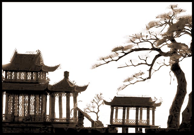
I have a little scene just like this enclosed in glass. I kind of think if the subject was completely black it would almost look like an ink drawing - or color paints. I feel you should have burned the glare on the top left of the large building though. good composition.
The backlighting is a little too harsh for me. I wonder if you were going for a silhouette. This would have made a great silhouette with all the fine detail in the buildings and tree. Composition works for me. 7
(I'm writing this to everyone who submitted a landscape shot) The challenge was to produce a shot worthy of a magazine cover but to me a shot like this is not suitable to be put on a "portrait" format magazine.
Is thi sa model? Nice pic though
---ADDITIONAL---
Due to forum discussions and accusations that marking landscapes down is nitpicking, I'm going through them and remarking. I still think some of the landscapes would not make good covers because of their orientation but I am no longer marking down because of that.
I still think landscape is inapropriate for the majority of magazines but I'll give the benefit of the doubt to the photographers.





 Add photograph to your favorites
 Add photographer to your favorites


 Photographer found comment helpful.


