File Name
Picture 041.jpg
Camera Model Name
Canon EOS DIGITAL REBEL
Shooting Date/Time
3/15/2004 12:40:17 PM
Shooting Mode
Aperture-Priority AE
Tv( Shutter Speed )
1/125
Av( Aperture Value )
4.5
Metering Mode
Evaluative
Exposure Compensation
0
ISO Speed
400
Lens
105.0 mm
Focal Length
105.0 mm
Image Size
3072x2048
Image Quality
Fine
Flash
Off
White Balance
Auto
AF Mode
Manual Focus
Parameters
Contrast +1
Sharpness +2
Color saturation +2
Color tone Normal
Color Space
sRGB
File Size
2696KB
Drive Mode
Continuous shooting
Owner's Name
Camera Body No.
0860319413
Statistics
Place: 47 out of 147 Avg (all users): 5.9777 Avg (commenters): 6.5000 Avg (participants): 5.7529 Avg (non-participants): 6.1809 Views since voting: 1339 Votes: 179 Comments: 27 Favorites: 1 (view)
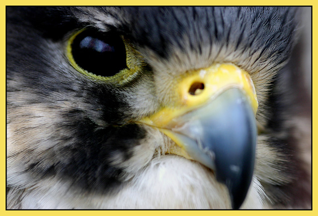
At first glance I didn't like this shot, and wouldn't even give it a vote. But now I really enjoy the almost too aggressive diagonal composition. It's hard to judge whether the bird is alive or not. But I really don't care in this case. The picture has got nice colours, and the sharpness is on the right spot, i.e. the eye!
The border is a bit overwhelming and the landscape format detracts from the Magazine Cover idea. Outside of those two items, strong image, very well captured.
I like the composition, but the depth of field is too narrow. The center of interest is the nostril, and it should be in focus, as well as the feathers with their fascinating texture.
(I'm writing this to everyone who submitted a landscape shot) The challenge was to produce a shot worthy of a magazine cover but to me a shot like this is not suitable to be put on a "portrait" format magazine.
Great pic otherwise though I do find the border distracting
---ADDITIONAL---
Due to forum discussions and accusations that marking landscapes down is nitpicking, I'm going through them and remarking. I still think some of the landscapes would not make good covers because of their orientation but I am no longer marking down because of that.
I still think landscape is inapropriate for the majority of magazines but I'll give the benefit of the doubt to the photographers.
Magazine covers should be Portrait not Landscape. It amazes me how many people don't seem to realize this or think of it. With the apparent high rez you have here, it seems you could have easily cropped this so that it's Portrait.
To much of the photo out of focus, I think. A larger dof would help, imo. I don't like the extreme close up all that much. I would have backed off just a bit for the shot.
Wow! This is an awesome shot. This is top quality and pitch perfect. I'm going to give you a high mark; however, you may find others will mark you down for having a horizontally cropped image instead of a vertically cropped image. IT seemed to be an issue in the last magazine challenge.





 Add photograph to your favorites
 Add photographer to your favorites


 Photographer found comment helpful.


