Cute. Not really appropriate for the cover of an entertainment magazine, but cute. Nice to finally see some signs of Spring (not here yet). Composition looks better to me when cropped on both sides.
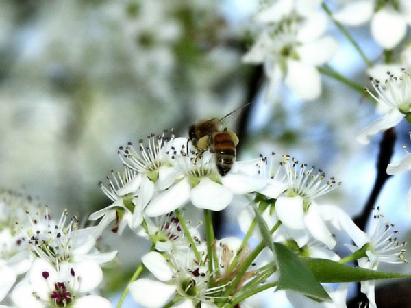
The shot fits the magazine's name, but it hardly looks like a magazine cover shot. The amount of background blur and the horizontal format hardly qualifies.
Beautiful photo! The color and lighting are nice, a little bright... but fine. The motion of the bee is neat too. I love hte composition and DOF of the flowers.
I like this! I like the framing of the insect against the pretty white flowers. The blurry background is perfect....I wish the insect was more in focus, but I know that is hard to capture just right....nice photo, and it would make a great magazine cover too....I like the softness of the photo
(I'm writing this to everyone who submitted a landscape shot) The challenge was to produce a shot worthy of a magazine cover but to me a shot like this is not suitable to be put on a "portrait" format magazine.
---ADDITIONAL---
Due to forum discussions and accusations that marking landscapes down is nitpicking, I'm going through them and remarking. I still think some of the landscapes would not make good covers because of their orientation but I am no longer marking down because of that.
I still think landscape is inapropriate for the majority of magazines but I'll give the benefit of the doubt to the photographers.




 Add photograph to your favorites
 Add photographer to your favorites


