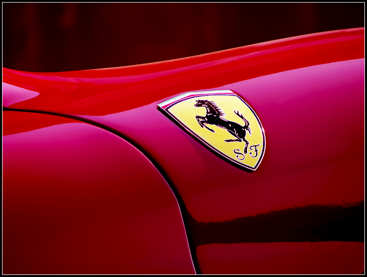
used curves & levels, unsharp mask, surface blur to get rid of the noise, cloned out some dust on the paint and burned and sponged the logo to make it stand out and remove fringe.
resized, added border and saved for web.
enjoy :)
Statistics
Place: 121 out of 185 Avg (all users): 5.2296 Avg (commenters): 5.0000 Avg (participants): 4.7193 Avg (non-participants): 5.3662 Views since voting: 766 Views during voting: 392 Votes: 270 Comments: 15 Favorites: 0
thanks for all the constructive comments, however i would like to point out that this is a color on color photo even if on some monitors it might not look so.
the background is clearly dark red and i take no blame for the constructor's decision to put a big yellow logo on that beautiful red car, but that shouldn't have been a problem since the photo that placed in front of me had a bunch of strawberrys with a lot of green on a reddish background (and even the winner has a lot of white on that lemon, but then white is not really a color right? :P).
all in all, seeing the comments i realize that i may have messed with the contrast a bit too much but, in my opinion, the best way to outline a Ferrari is to present it on a dark background (and the challenge rules didn't say anything about the luminosity of the background or that of the subject, just that they should be of the same color). And, it's true, I oversharpend it just a bit to enhance the lines even more.
i was expecting more comments on the photo itself than on the challenge requirements, anyway i placed a request for a review from the club, if they'll ever get to my photo...
For the life of me I can't understand what that black area is under the Scuderia Ferrari is??? beautiful line are a given for most of those masterpieces... putting something attractive in front of the lens always helps make a better picture.






 Add photograph to your favorites
 Add photographer to your favorites


 Photographer found comment helpful.


