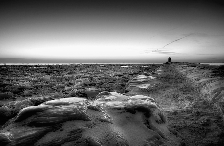
Taken during the ice carving festival. Just before sunset we decided to head down to the lake to catch the sunset. The trip was longer than we thought and I ended up going by myself since we had the stroller and the girls were cold. This is an ice-encrusted walkway with water on both sides that run parallel with a lighthouse on the other side of the harbor. I was amazed at how many people were out there navigating the ice and snow. This was well after sunset and I was on my way in and there were people still heading out!
I was trying to capture how much ice was really out there, both on the walkway and in the water.
Lots of editing (color version):
hdr/tonemap (-2, 0, +2)
tons of color adjustments
levels
dodge/burn
nik efex glamour glow filter
rotate/crop
resize
Convert to B&W:
Tiffen Dfx high contrast B&W filter (15 day free demo!)
Strongly feel the BW speaks, as if all the ice and iced over elements are about to rise in some tympanic grumbling rumbling symphony. (Keeping the filter?)
I'd probably have stopped with the colour version as 'the shot'. as people have said the 2 versions are poles apart in what the viewer sees. Fantastic descision to convert to B&W. might be fun to print them both large and hang on your wall (if there is any space left lol).
Man, this is good. Awesome textures here. I would love to photograph a scene like this. Another good option for this shot would have been a closer view of the structure to the right off in the distance.
I prefer the B&W version here. Why? Because by removing the color, you've focused on the form and the light, and the way that ice looks is far more impressive (to me, anyway) in B&W. Excellent compositional choice.
This is wicked cool. The only reason I'd say that I wish it were ever so slightly brighter is because I wasn't exactly sure what it was at first. None-the-less I love it. Beautiful display of textures in the conversion. Question: Is the water on each side frozen or is the water just rough?
I love this and it is much more impactful than the color image. I think the B&W gives a sense of the texture of the ice and it communicates the coldness much better.
Ken, this is awesome! The black and white photo looks completely different -- and so much more dramatic. The impact of the black and white one is so strong! The color one is pretty, but the black and white one is striking and has a strong impact -- both from the thumb, and even more so when it opens up.




 Add photograph to your favorites
 Add photographer to your favorites


 Photographer found comment helpful.


