Rush job because I've got to spend more time actually writing my thesis and less time shooting for challenges. I've been carried away with all the fun and learning at DPC and now I want to be a professional photographer...but for now I need to be a professional thesis writer :)
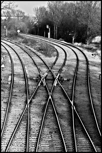
This is really not a great composition. It's unbalanced and not that interesting because the lines don't lead anywhere special. I do love the curves though - they seem very sexy and elegant for some reason. I overdid the contrast to emphasise the rails, in line with the title.
I don't expect anything of this - just as long as it doesn't PW I'll be happy.
The reason this is at an odd exposure is that this is the -2 bracket taken from a bracket set. The regular exposure was overexposed so I took this and pushed the exposure to 1.20. My intention was to shoot an HDR scene but then realised when I got home that it's a basic challenge, so I had to make do with b&w...which is a shame because the colour full tonal range version would have been lovely.
Post Challenge: This did a lot better than I had expected. It's still gloriously average which isn't good enough...I need to get a 6 one of these days soon.
Statistics
Place: 57 out of 262 Avg (all users): 5.8879 Avg (commenters): 6.7778 Avg (participants): 5.6835 Avg (non-participants): 6.0000 Views since voting: 910 Views during voting: 323 Votes: 223 Comments: 9 Favorites: 0
I am not sure whether there is an unambigious definition of leading lines, but in my book, they should be a line or several lines that lead the viewer's eye towards the main subject of the picture. I think that's not the case in this picture. Your pic uses a vanishing point rather than leading lines.
I really like this one, the tracks are definitly leading as they take my eyes away and I like how it brings my attention back to the crossover track and holds my attention there. Goodluck!





 Add photograph to your favorites
 Add photographer to your favorites


 Photographer found comment helpful.


