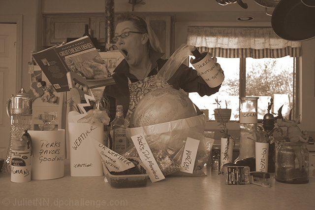
Just a fun shot, not expecting it to do well, but there ya go!
Steps.
Took photo
desaturated colour
resized for web
post challenge;
I agree with every comment on here. It so needs more contrast (I hadn't learnt about dodge and burn then) and there is too much in there to make a difference.
The concept was, Making the world and accidently adding Jerks instead of Perks.
Thank you guys for taking the time to comment!!
Statistics
Place: 58 out of 75 Avg (all users): 5.0165 Avg (commenters): 5.9231 Avg (participants): 4.4474 Avg (non-participants): 5.1667 Views since voting: 1014 Views during voting: 467 Votes: 182 Comments: 15 Favorites: 0
It's funny, but I totally think I am missing something? Photographically, I like the sepia, though it is a bit flat and could stand a touch more contrast.
I want to like this. It's cute, but very busy. So much going on that I find myself moving on rather than staying and sorting it all out. I think if this was simplified by removing at least half of the objects it could have a stronger immediate impact. Also, her face has a fun expression that is not featured enough (some fill flash or dodging/lightening perhaps?).
Overall a great effort. Best of luck to you in the challenge.







 Add photograph to your favorites
 Add photographer to your favorites

 Photographer found comment helpful.


