|
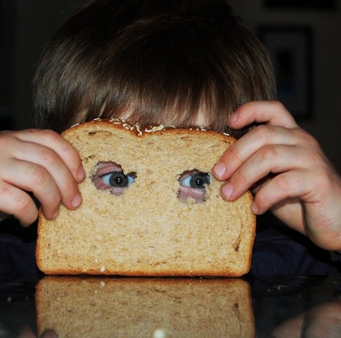
I like the idea, and I like the fact that the kid seems to be taking a pic with the bread. I think much could be gained by improving your composition though. There seems to be no specific reason for the square crop here, whereas the upper part of the image has no function wahtsoever. Using this composition, you place the eyes in the center of the picture, rather than at 2/3, where they would fit better imo. On top of that, you crop off both hands fairly tightly, as well as the reflection of the bread. Why not take the bottom of the bread as the centre of your pic, creating symmetry, with the eyes both on 1/3 and 2/3 of the picture? Or crop this one to a landscape pic, in the meantime getting rid of this disturbing OOF crum in the front and the empty space above? |