| Author | Thread |
|
|
02/13/2008 01:50:10 PM |
|
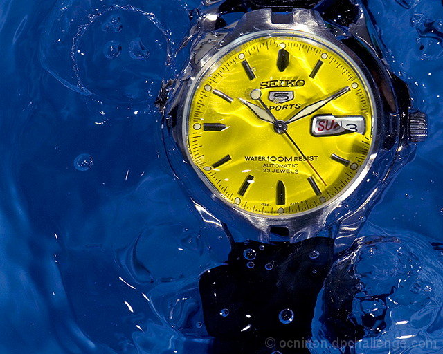
Nice shot! You even have the hands at the obligatory 10 and 2 positions for watch/clock shots. Congratulations! |
|
|
|
02/13/2008 01:03:25 AM |
|
This is a stunning shot, absolutely perfect for the challenge. Congratulations on your first ribbon and PB, Orlando. |
|
|
|
02/13/2008 12:23:58 AM |
|
Congratulations on the yellow and new PB |
|
|
|
02/13/2008 12:21:08 AM |
|
Congrats on your new personal best and first ribbon! |
|
Comments Made During the Challenge  |
|
|
02/12/2008 06:18:58 PM |
|
My favorite watch shot from the challenge. Great shot. |
|
|
|
02/12/2008 12:14:18 AM |
|
Beautiful colors and clear. well balanced. very nice. 8 |
|
|
|
02/11/2008 10:06:31 PM |
|
I like alot of things about this and believe it would make a really effective ad photo. The colors are bright and attract attention. The comp allows for text placement and the texture of the water makes the whole ad more interesting visually.10 |
|
|
|
02/11/2008 02:12:06 PM |
|
Wonderful complimentary colours - crisp shot, and a nice touch having the water across the face, deserves to do well. |
|
|
|
02/11/2008 10:16:08 AM |
|
The bubles in the water add texture which makes this photo strong |
|
|
|
02/11/2008 09:37:16 AM |
|
The colors in this photo are very vibrant; eye catching. |
|
|
|
02/11/2008 03:15:53 AM |
|
|
|
02/10/2008 10:05:32 AM |
|
Very good color clarity and composition. |
|
|
|
02/10/2008 01:47:42 AM |
|
Nice capture. The bubble(?) in the upper left looks weird to me and keeps drawing my eye away from the watch. |
|
|
|
02/08/2008 10:08:18 AM |
|
great idea. i really love the colors because they contrast eachother |
|
|
|
02/07/2008 09:42:41 PM |
|
I love the water and the contrasting yellows and blues. |
|
|
|
02/07/2008 07:56:14 PM |
|
great clear shot. the yellow stands out against the blue, and this is the kind of shot watch manufacturers use to show off their products. good sharpness too. 8. |
|
|
|
02/07/2008 07:51:42 PM |
|
Beautiful picture, the contrasting colors look great up against eachother and the lighting creates a beautiful effect with the water. |
|
|
|
02/07/2008 07:30:19 PM |
|
I really like the colors and composition in this. Great lighting as well. Nice work. |
|
|
|
02/06/2008 09:04:03 PM |
|
|
|
02/06/2008 04:39:17 PM |
|
Very nice! Love the contrast of yellow against the blue water. Nice stop-action of the water. Great idea to put it in the water - and keep the words on the watch very clear, so you can see that it is water-resistant. Great concept all around and very well executed! |
|
|
|
02/06/2008 04:25:18 PM |
|
Great idea, love the colour on the shot. |
|
|
|
02/06/2008 03:44:27 PM |
|
|
|
02/06/2008 03:40:12 PM |
|
|
|
02/06/2008 03:12:19 PM |
|
|
|
02/06/2008 10:15:07 AM |
|
Nice color contrast nad variety. |
|
|
|
02/06/2008 09:42:41 AM |
|
WOOOOOWWWW! Another great shot... Voting 10. |
|
|
|
02/06/2008 09:40:01 AM |
|
|
|
02/06/2008 03:55:13 AM |
|
The yellow and the blue don't go too well togeher. |
|
|
|
02/06/2008 12:12:48 AM |
|
blue-n-yellow...just fantastic. a definite contender for the podium. |
|
Home -
Challenges -
Community -
League -
Photos -
Cameras -
Lenses -
Learn -
Help -
Terms of Use -
Privacy -
Top ^
DPChallenge, and website content and design, Copyright © 2001-2026 Challenging Technologies, LLC.
All digital photo copyrights belong to the photographers and may not be used without permission.
Current Server Time: 06/28/2026 06:40:57 AM EDT.


 water100Mresist


