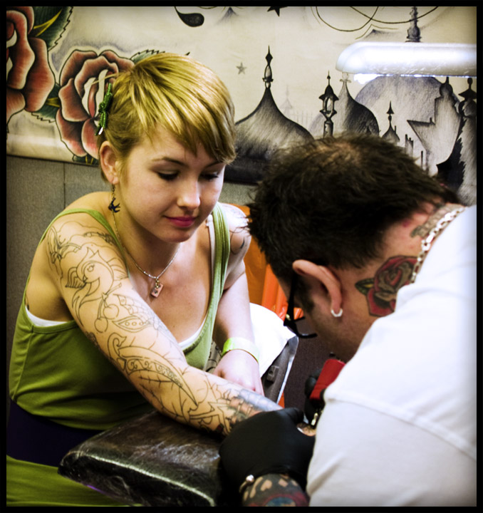
I like this composition with the diagonal arm adding some tension and the diagonal line in the background. I think the processing is fine and the lighting is good. For some reason I don't feel "involved" in the scene though..perhaps because the girls expression is so "hum drum". I think it is the small things that brought this photo down to its score..the flourescent light, and the tatooers OOF back of head. Also keep in mind that this is a free study so the voting can be harsher. This had the capability to score in the 6s in a themed challenge in my opinion.
I think this image had great potential. I like the subject and the girl is very cute...so I don't think that was the real problem. I would like to see the colors improved a little (mentioned below). I am also left wanting a little more sharpness. Lastly, I think if you had just inched over a little to your left the composition would have benefited...I just would like to see a little more of the tattooing.
I really like the processing on this. I think the reasons for the low-ish score have been pretty much covered, but well done for submitting something a little different.
I think your composition is good and the subject is interesting. I don't have much insight to offer that hasn't already been covered. I do know that the majority of voters don't respond well to greenish casts on images. A couple of times I used a greenish tone intentionally, and both times I got slammed, and enough comments make it clear that they didn't like the green tone.
One thing that the others haven't mentioned is that there is a very lot going on in this image. The voters like uncluttered, simple shots with a clear focal point that draws the eye. Maybe a shallower DOF focusing on the arm would have made this look less like a candid, and given the viewers a little more direction for their wandering eyes.
BTW, I like it, and I like the big flower on the back of her head.
I really like the subdued colors in this shot. The repetition of tattoo motifs (on the neck, the arm, the wall) is awesome. Nice, tight crop - excellent. I'm sure it didn't get a higher score because there is no wow- or aw-factor. It's "just" an interesting, good candid.
I agree with Kelli's comment: tatooing on women turn a lot of people off and I wouldn't doubt that it has contributed to your low score as much as anything. Also, in your PP some of the green has shown up in her hair and her skin tones. The left arm has been blown out and maybe you could have saved some of it using adjustment layers and playing with the contrast. The composition looks good and the expression on her face relays just a hint of pain (and I'm not sure that is good or not). Looking at other shots in your portfollio, I say this is not one of your best but that you do have an eye and have the potential of being a really good photographer. Best of Luck. X
Yeah, at first I thought that rose what attached to her hair, too! I like the rich colors - suits the subject matter. There may have been a cringe factor with the voting on this photo - I remember when I first came across this picture my first thought was "ouch"! :)
I adore how it looks like the flower on the wall is actually on her head like an extension of the barrette. The processing is beautiful. That said, tattooing (especially on women) seems to turn a lot of people off, which could account for the low score.





 Add photograph to your favorites
 Add photographer to your favorites

 Photographer found comment helpful.


