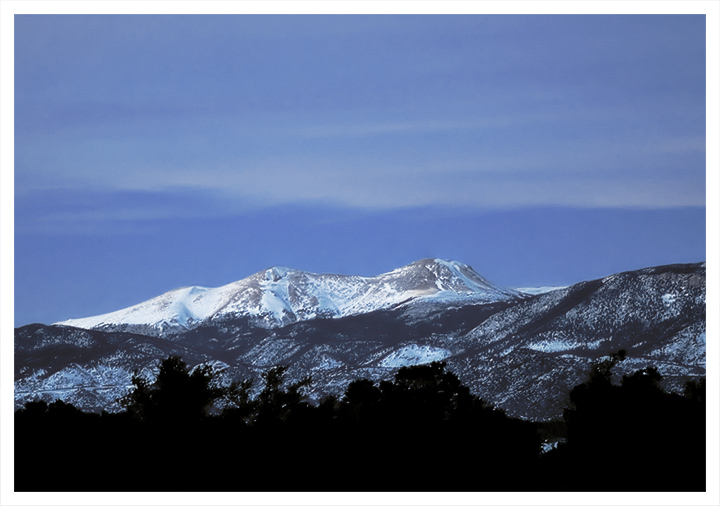
Hmm. Pretty scene and lovely blue to the sky. I like the mountains. The crop does feel like there's a bit too much sky because the clouds are not very dramatic. I think I would like to see more detail in the foreground. Not tons, but a little. It's too solid and dark for the rest of the scene IMO.
I like the subject matter in this shot. Because it is Advanced Editing, you might have wanted to try and pull a little more detail out of the sky. On that note, it is a bit hard to determine whether you are making the sky the subject or the mountains. IMO, I might have tried cropping more of the sky out to make those beautiful mountains more of the subject. When it's so close to center (not on a third), it gives equal weight to the sky and land, so you really have to have something dynamic in each to pull it off. The focus and detail is very good. perhaps a run at shadows and highlights might give it just a little extra "sparkle". It's a very pretty shot. (I am by far not an expert, nor do I play one on TV, so take all of this w/a bit of scepticism. :~} )
I didn't vote on this one, and I'm not sure what I would give it. My overall impression is of something missing - more detail, more sky, more of something that was cropped out? I'm not sure what.
Lovely shot, but I get the feeling you're caught between compositions here - in other words you either need less sky (to emphasise the thirds: trees, mountain, sky) or much more to create a more daring negative space. I know this was shot with a prime but perhaps an unorthodox portrait orientation? It's just a thought. It's the implied indecision which prevents the shot really working for me.






 Add photograph to your favorites
 Add photographer to your favorites

 Photographer found comment helpful.


