SilkyPix
- little strong contrast
- portrait color 1
- faint sharp
- convert to TIFF
PSP X2
- brightness & contrast: clarify +1
- smart photo fix (28,-10,20,2,86,8,16)
- brightness & contrast: histogram (0,1,250)
- duplicate layer
- nikEffects filter: B&W (4,75)
- brightness & contrast: levels (9,232)
- duplicate layer
- xero filter: softmood (50,50,50,50,0,0,)
- layer blend mode: softlight 8% opacity
- duplicate softmood layer
- layer blend mode: dodge 8% opacity
- merge all (flatten)
- duplicate layer
- softness: soft focus (50,50,50,50,0)
- darken brush around edge
- duplicate layer
- clone out window decoration over heads
- clone out remnants of dark square pattern by nose
- crop
- resize
- merge all (flatten)
- duplicate layer
- smart photo fix (5,0,-10,37,25,0,6)
- hsm (15,20,softlight)
- noise reduction: s&p (1,2)
- merge all (flatten)
- save as JPG
Way too much effort in this one! Just got carried away I guess. :-)
++++++++ Post-challenge comments ++++++++
One of my lowest scoring images here at DPC over the years, but I still like it and don't regret anything except maybe the decision to add grain. May reconsider that next time. :-P
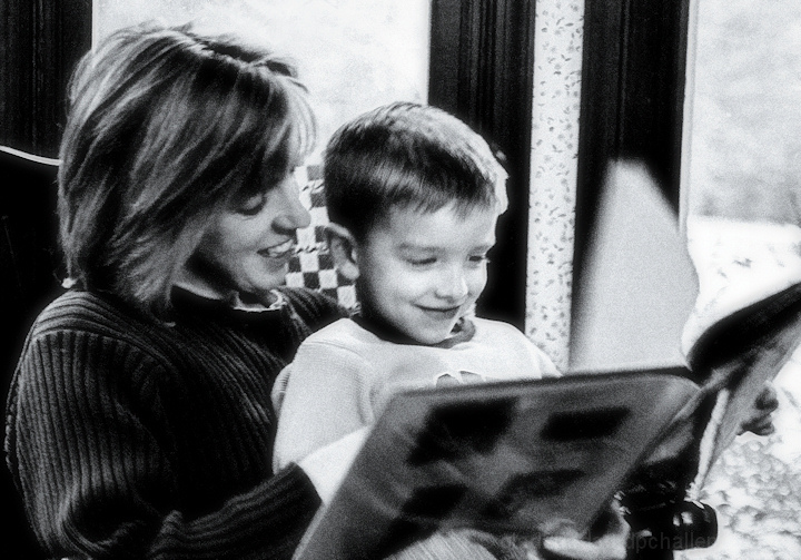
My wife and son were reading a book and I enjoyed the scene. Couldn't help but grab the camera. After looking at what I'd captured I liked the natural light coming in from the windows, the happy content faces, and the motion of the turning page.
I was torn about which way to go with this processing-wise. Did some experimenting with recently acquired filters. The nikEffects B/W filter gave this a nostalgic look I like (color was too busy, knew I wanted B/W) and the grain option of the filter seemed like a good idea at the time. He-he.
Statistics
Place: 417 out of 428 Avg (all users): 4.3723 Avg (commenters): 4.4000 Avg (participants): 4.3444 Avg (non-participants): 4.4255 Views since voting: 1051 Views during voting: 189 Votes: 137 Comments: 13 Favorites: 0
i don't think it's a bad photo and the scene is very touching and candid. i like how the page is in the middle of being turned. i kind of like the grain but overall have mixed feelings about how it has affected the photo
First of all sorry for not repling your PM, i am just too tied up with things around me, life is being little turbulent.
One of my lowest scoring images here at DPC over the years, but I still like it and don't regret anything except maybe the decision to add grain. May reconsider that next time. :-P
In my opinion it is the grain that makes this picture and creates the mood. Don't take the scores to heart, DPC being populated by photographers mainly the technicals overpower their decision making while voting but there are people like me who try to think photographs as moments of life we wish to keep with us. This is one of such photographs.
This has a very sweet and classic immediacy. The strength is in the two almost sketched faces; but I think the background of checked cushion and the bright line/cord behind the woman's head seriously interfere with our enjoyment. Overall balance and composition spot on.
Got to agree with some of the commenters - the grain gives the shot an edginess that it really does not need. The really sweet moment captured here might have been better served by a softer look, less gritty look. Keep in mind all this is very subjective - more about how a shot "feels" than what it "should" be.
This has a really good composition. Very balanced and has "movement" through the frame. The expressions on their faces make the viewer smile -- they look so happy. The black and white conversion works well too -- you have good contrast, etc. The major detractor for me was the grainy look. A little might have been okay. This almost struck me as a shot you got in the dark and had to brighten it a lot (and introducing noise) to get it to work.
Firstly, the B&W is contrasty and well-controlled, and the moment you've captured is a lovely one. My biggest gripe is that the grainy conversion doesn't suit the nature of the photograph - I would think this sort of look would be more appropriate for high-energy scenes, gritty street shots etc. rather than the subtler and more human moment you've shot here. I think it's this disparity that's resulted in the low score.









 Add photograph to your favorites
 Add photographer to your favorites

 Photographer found comment helpful.


