Okay, here are my editing steps:
Crop Square
Layer
Shadow/Highlight
Levels (messed with all 3 channels) reduce opacity
Hue/Sat (colorized to sepiaish tone)
Brightness/Contrast (13, 19)
Levels again redux opac
flatten all
dup layer gaussain blur redux opac
flatten
USM
flatten
resize
add noise (gaussain) monochrome
add border/stroke 5px centered
I hope this goes over well... I GOTTA WIN SOMETHING SOMETIME OR I WILL HAVE TO TAKE A HUMILIATING SP!!! LOL
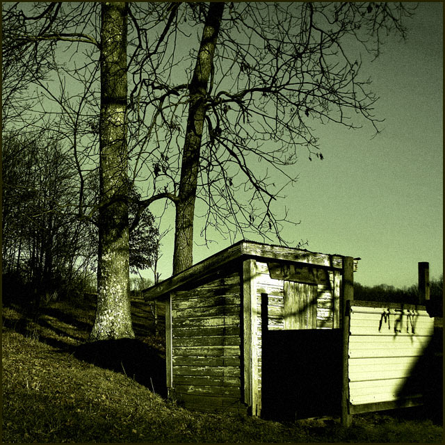
Yes, this is really an outhouse... yes, it is still used :)
Statistics
Place: 87 out of 159 Avg (all users): 5.2085 Avg (commenters): 6.1250 Avg (participants): 5.1111 Avg (non-participants): 5.2376 Views since voting: 744 Views during voting: 333 Votes: 235 Comments: 10 Favorites: 0
I love the tones. Some of the greens and browns you coaxed out of the image are almost the color of... well, we don't have to go there.
Maybe it was by design, but the sky in the upper right is a bit noisy. Of course, I'm not sure how you could have fixed that (at least not in Basic editing) without losing some of the texture that really makes this image.
5.2? I gave this a six and think it should have scored closer to that. Nice job!
Cool looking structure. Nice green cast to this monochrome image... But it doesn't look like an outhouse to me. And the graffiti detracts from the beauty of the image. I'd crop that part on the right out.
Makes me want to hold my nose! Good color for theme. The trees hovering overhead makes the picture scary; I wouldn't like to go there out in the dark. Although the shadows are essential to the theme, I think it would look better without the shadow in the right foreground.






 Add photograph to your favorites
 Add photographer to your favorites

 Photographer found comment helpful.


