DPChallenge: A Digital Photography Contest You are not logged in. (log in or register
 
Challenge Entries
This image is not a part of any challenge.
Portfolio Images
This image is not part of a public portfolio.
The Light
The Light
haze


Photograph Information Photographer's Comments
Date Uploaded: Jan 26, 2008

Viewed: 304
Comments: 4
Favorites: 0

N/A

Please log in or register to add your comments!

AuthorThread
04/30/2008 10:28:40 AM
interesting soft colour has unusual effect on skin tone.
  Photographer found comment helpful.
04/14/2008 01:59:07 PM
I so would have liked to see this really well exposed (IMO) photo with a real wax candle of some sort rather than a "tealight" ... but maybe that is just me ... beautiful focos on the hands and cross.
  Photographer found comment helpful.
02/01/2008 02:21:51 PM
I wish the hands were in better focus... but I really like the rich tones and the beautiful lighting. The composition is also nice. I'm not entirely sure about the color. I could go either way with it. Fix that focus, and I think this will be a truely beautiful image!
  Photographer found comment helpful.
01/27/2008 01:34:15 AM
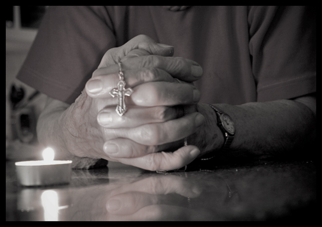
This is my favorite of yours so far--very nice! I might crop the top just a tad (collar or chin is creeping into the image)

I am not really a fan of over-using photo shop, but I think you might want to manipulate the area just to the left of the elbow: maybe clone in some plain wall, blur it up some, or something. I think you have a beautiful image here, and the candle & candle-lit hands and rosary are just wonderful, as is the reflection on the table. Since that background clutter is right above the candle flame, the viewer might find themselves noticing it more than you might expect. Guide our eyes a little bit on this one, and we will linger, but if our eyes get pulled off to the side of the main subject, we lose the fantastic mood you have set and captured here.

If you can select the fingers and crucifix and apply a bit of unsharp mask style sharpening just there, it will help a bit, since that is the main subject.

The tones and tonality you have established here are perfect, I think.

The window panes in the upper left corner are fine, and the dark corner there helps set a boundary, and balances the the dark corners on the right, as well as giving a sense of depth to the setting.

Nicely Done. Thanks for sharing this with us.

Message edited by author 2008-03-01 20:42:15.
  Photographer found comment helpful.


Home - Challenges - Community - League - Photos - Cameras - Lenses - Learn - Help - Terms of Use - Privacy - Top ^
DPChallenge, and website content and design, Copyright © 2001-2025 Challenging Technologies, LLC.
All digital photo copyrights belong to the photographers and may not be used without permission.
Current Server Time: 06/08/2025 03:59:20 AM EDT.