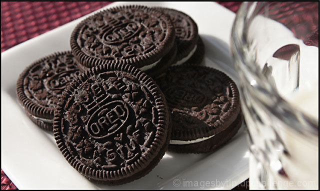
The milk in the corner takes away from the picture. Draws your eye there instead of to the oreos. Moving the milk more in the picture and putting it in focus could have turned out better.
Lovely DOF, nice and sharp on the leading biscuit. The two colours (browns and reds) work really well together and are not lost by accidentially having any other main coloured features/objects in the frame. Well composed too.







 Add photograph to your favorites
 Add photographer to your favorites


 Photographer found comment helpful.


