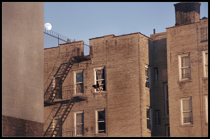
love the composition of the moon over the barbed wire...also love my eyes playing following the lines of the fire escapes, the windows, and thhe building edges..
so sad to have to reach so far out a windo to be abelt o see the moon eh?
Unfortenately this snapshot does not work for me. The moon is blocked and the wall on the left is just wasting spaoace providing no value. The image is a little flat and would have liked to see a little more contrast. Sorry. Good Luck. 4.
i like the verticle lines - but i think it could do with a bit more contrast to really have them jump out at us on the screen - but i think this would look great as is printed...
This is an interesting image, but one that proves the maxim that moving just an inch or two can sometimes make or break an image. The fact that the moon is tight against the edge of the wall--and slightly behind the barbed wire--seems to indicate that you wanted to include it in the image, but didn't consider how you wanted it composed. Moving a bit back and to the right would have brought the moon out into the open sky, making it more prominent. Or, you could have moved forward a bit, putting the moon behind the fence, which might be a personification of urban oppression (or some other theme).
The detail in the brick is nice in the bottom left corner. A bit of high pass sharpening might have really boosted the local contrast in this image.
Difficult composition; I'm not sure the colour works well, and I'm not sure about your cropping - it seems you've made that strong vertical image left your guide, but that makes your framing of the building with the figure appear tilted - and just slightly enough for it to seem accidental, and thuis disturbing.





 Add photograph to your favorites
 Add photographer to your favorites


 Photographer found comment helpful.


