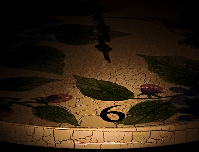
Nice texture, meets challenge, good DOF but the subject is not very interesting. With that said I think you did a good job. I think if the hands of the clock would of been set at a different time instead of 12, it may have added another element and would have made the subject more interesting.
This is a strooong image:) The limited lighting, the mood and the aged patina of the clock all work. I usually don't like centred images, I don't think it's wrong in this case at all.
The stuff on the sides is distracting. Even though my eyes go to the 6 first, I am confused by the other stuff going on in the darkness. Maybe that was intentional. :o)
I really like the lighting and texture on this. The only thing that kind of bugs me is the clock hand at the top. Either it should be cropped out altogether or it should be in the image pointing at the 6.





 Add photograph to your favorites
 Add photographer to your favorites


 Photographer found comment helpful.


