Author Thread
Post actions
Nice picture. Title fits properly.
Comments Made During the Challenge
Post actions
Post actions
Post actions
Post actions
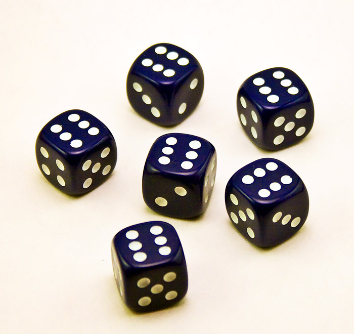
Perhaps if they were arranged in an interesting manner, it would be more appealing. There's no wow effect and the white balance is kida off.
Post actions
Post actions
Over exposed and a little grainy...
Post actions
Post actions
I have 2 suggestions for improving this. 1) Increase the DOF to bring each die into crisp focus. 2) Watch the gradient color cast of your background. My guess is your lighting was on a big of an angle giving a dark shadow on the bottom gradually decreasing to light on the top.
Post actions
Perhaps a slight levels adjustment





 Add photograph to your favorites
 Add photographer to your favorites

 Photographer found comment helpful.


