DPChallenge: A Digital Photography Contest
 
Challenge Entries
Portfolio Images
This image is not part of a public portfolio.
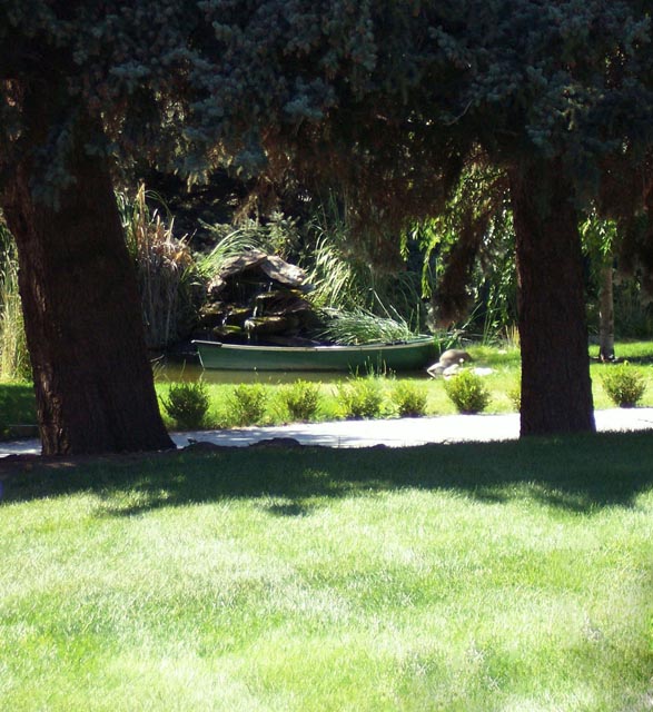
Suburban Oasis
Suburban Oasis
Pick001


Photograph Information Photographer's Comments
Challenge: Framing III (Basic Editing)
Camera: Fujifilm FinePix S5700
Location: Boise Idaho
Date: Jan 16, 2008
Galleries: Landscape, Water
Date Uploaded: Jan 17, 2008

This was someones water feature in their front lawn. I took it from their neighbor's lawn on my way home from another photo shoot.

Statistics
Place: 140 out of 159
Avg (all users): 4.5310
Avg (commenters): 3.9000
Avg (participants): 4.0577
Avg (non-participants): 4.6724
Views since voting: 777
Views during voting: 330
Votes: 226
Comments: 10
Favorites: 0


Please log in or register to add your comments!

AuthorThread
 Comments Made During the Challenge
01/28/2008 03:24:50 PM
Oh man. Why didn't you move in about 7 or 8 steps closer? You have a decent subject item here, but the foreground grass is really taking away from the overall impact of the presentation. Another option/choice would have been to use a split ND filter upside down to control the light on the grass (polarizer instead perhaps?). Lots of light reflecting off those grass blades. Just some observations. Good luck!
01/28/2008 02:03:40 PM
It's okay.
01/27/2008 01:38:28 AM
Comp does not really seem to work. I'd suggest cutting off a lot of the grass and a bit of the treetops.
01/26/2008 11:08:56 AM
There's too much light and shadow here for me. The best lit part of the picture is the grass.
01/25/2008 01:57:42 PM
I think you could have improved this by cropping of the bright grass in the foreground
01/25/2008 12:35:19 PM
Very nice.
01/23/2008 05:53:45 PM
i think this would have a better overall effect if it was cropped in a little more (my opinion)...but still a good shot.
01/23/2008 10:11:58 AM
There's too much over exposed foreground.
01/23/2008 07:46:15 AM
Nice place. I think that composition could have been improved. The grass in the foreground takes too much space in the image.
01/23/2008 06:31:38 AM
I like the composition, but the foreground is very light. Think it would be nice is you cropped away the foreground and let the trees and the shadows frame your photo.