| Author | Thread |
|
|
02/13/2008 06:03:32 PM |
|
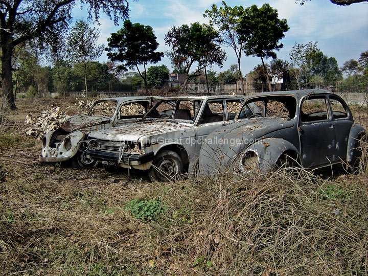
I agree with the weeds behind the car causing some distraction. Also the picture seems a little off center to the right due to the crop. It does seem like an interesting subject though. Maybe a dawn / dusk shot would make it a little more dramatic. |
|
 Photographer found comment helpful. Photographer found comment helpful. |
|
|
02/08/2008 09:26:56 PM |
|
I like the subject, but I think there is a little too much detail in the background and it takes away from the cars. Getting closer or using a shallower DOF might make them stand out better. Or, crop out most of what is above the fence to emphasize the cars and weeds. Maybe play with dodge and burn to make them stand out more, too. |
|
| Photographer found comment helpful. |
|
|
02/08/2008 01:52:24 PM |
|
Ok...I like the subject matter here. You would have done much better shooting at a different time of day (early morning or late afternoon/evening) to get much better lighting. The light here is a little harsh to me. A much shorter DOF would have given more weight to the cars and given you a more diffused background and foreground. A different perspective would have really helped on this one. (There is the issue of the big "hump" in the way from where this was shot.) Had you been able to pull the clump of weeds away and gotten lower, this would have been much more interesting. Because the colors are not really dynamic, there needs to be something else to draw the viewer in, and unfortunately, there is a lot going on in this shot. :) (I'm no expert!) |
|
| Photographer found comment helpful. |
|
|
02/08/2008 12:31:30 PM |
|
I think it was the dead center horizontal composition that made me score this low. Also the trees, buildings and fence in the background distracted me - their color and texture was more interesting. (I gave it a 5) |
|
| Photographer found comment helpful. |
|
|
02/08/2008 08:32:11 AM |
|
A nice subject which, like the previous commenter said, could perhaps do with a more imaginative composition that captures some of the key aspects you're trying to convey. |
|
| Photographer found comment helpful. |
Comments Made During the Challenge  |
|
|
02/03/2008 09:37:54 PM |
|
Sorry if this comes across as harsh, but there isnt a lot in this photo that draws me. I think it could benefit from a different perspective, or composition. |
|
| Photographer found comment helpful. |
|
|
02/02/2008 04:30:30 PM |
|
different. ZSubject is not very appealing, but speaks volums to todays society. |
|
| Photographer found comment helpful. |
Home -
Challenges -
Community -
League -
Photos -
Cameras -
Lenses -
Learn -
Help -
Terms of Use -
Privacy -
Top ^
DPChallenge, and website content and design, Copyright © 2001-2026 Challenging Technologies, LLC.
All digital photo copyrights belong to the photographers and may not be used without permission.
Current Server Time: 07/01/2026 12:08:13 AM EDT.