| Author | Thread |
|
|
01/20/2008 10:29:56 AM |
|
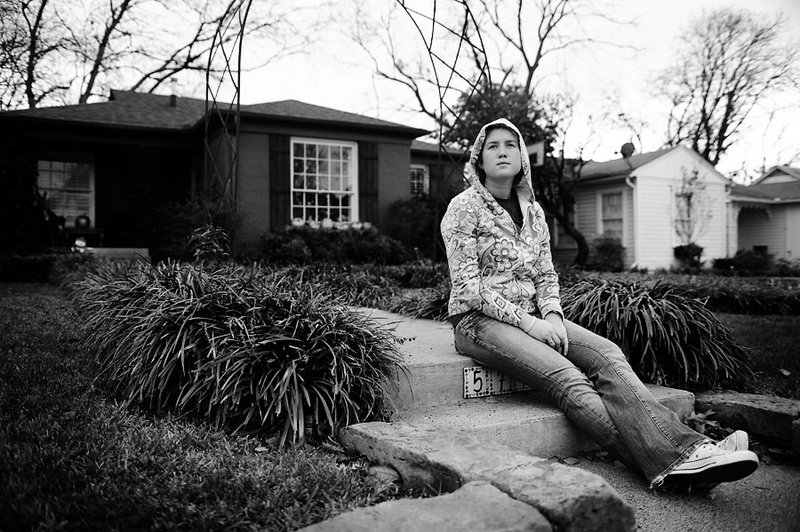
I think the composition and general 'feel' of the picture is great. The title certainly accentuates the feeling. The only thing I'd change would be to darken the farthest house (the white one). It sort of draws the eye away from your subject. But the B&W works very well, makes it seem more dreary. |
|
 Photographer found comment helpful. Photographer found comment helpful. |
|
|
01/20/2008 10:12:01 AM |
|
I like the shot but personally I'd either have sharpened up the house by closing down a bit, or blown it all out by opening up a bit...but in between is neither, in that she's in focus but the house isn't - but it is enough in focus to distract from the subject. I like the composition a lot...the tones are really nice and it works well in contrasty b&w. |
|
| Photographer found comment helpful. |
|
|
01/20/2008 06:29:08 AM |
As requested in your thread, here are my thoughts on this shot.
I like the overall feel of the shot and the choice of black and white processing works well. There is something about the tree in the back right corner that keeps grabbing my attention away from your subject. Have you had a look at this with a tight crop around the girl only, as there is really not all that much in the background to support your main subject IMHO. A tighter crop would still leave you with the white house, hence leaving the viewer with the impression that the subject is sitting at the front of the house.
Nice work
|
|
| Photographer found comment helpful. |
Home -
Challenges -
Community -
League -
Photos -
Cameras -
Lenses -
Learn -
Help -
Terms of Use -
Privacy -
Top ^
DPChallenge, and website content and design, Copyright © 2001-2026 Challenging Technologies, LLC.
All digital photo copyrights belong to the photographers and may not be used without permission.
Current Server Time: 07/17/2026 05:11:39 AM EDT.