| Author | Thread |
Comments Made During the Challenge  |
|
|
01/15/2008 11:31:45 AM |
|
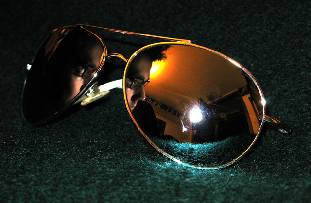
Nice composition....i think the face should come more forward and in someway adjust the white flash, to not show the reflection, make this picture perfect. |
|
 Photographer found comment helpful. Photographer found comment helpful. |
|
|
01/14/2008 05:12:37 PM |
|
I like the idea, the colors and the focus. The hot spot in the center of the lens is very distracting, though. |
|
| Photographer found comment helpful. |
|
|
01/11/2008 08:28:42 PM |
|
|
|
01/10/2008 08:10:15 PM |
|
Good job using reflections for this shot! |
|
| Photographer found comment helpful. |
|
|
01/10/2008 07:48:23 PM |
|
very creative with just a couple of light distractions... |
|
| Photographer found comment helpful. |
|
|
01/10/2008 05:31:16 PM |
|
Such a shame you got that flash glare, apart from that I really like this. |
|
| Photographer found comment helpful. |
|
|
01/09/2008 10:49:27 PM |
|
I really like this shot but I can't give you a good reason why!! It's really appealing...maybe it's the green and orange colours, or the frame within a frame...or the two lights....weird ingredients that really come together for me. I also really like seeing the more creative attempts, so I'm giving you an extra couple of points to compensate for all the dog-in-glasses voters :) |
|
| Photographer found comment helpful. |
|
|
01/09/2008 09:38:37 PM |
|
| Photographer found comment helpful. |
|
|
01/09/2008 08:18:09 PM |
|
don't like the glare on the lense,, otherwise a good idea |
|
| Photographer found comment helpful. |
|
|
01/09/2008 07:07:48 PM |
|
Wow I really like how you have the glasses in the glasses. It's really cool. The glare creates a pretty cool lighting too. Good job |
|
| Photographer found comment helpful. |
|
|
01/09/2008 06:51:16 PM |
|
|
|
01/09/2008 04:05:34 PM |
|
The main point of focus is the large white light rather than the face. I'd have thought more about the lighting in this picture. |
|
| Photographer found comment helpful. |
|
|
01/09/2008 12:48:03 PM |
flashhhhhhhhhhhhhhhhhhh is so freakin bright plus its toooooo much so
thats the reason this picture sucks |
|
|
|
01/09/2008 09:54:53 AM |
|
I like the idea but the hot spots are a distraction and the green felt not an appealing choice. |
|
| Photographer found comment helpful. |
|
|
01/09/2008 12:59:21 AM |
|
Glare spot on the lens is distracting. Nice idea. |
|
| Photographer found comment helpful. |
Home -
Challenges -
Community -
League -
Photos -
Cameras -
Lenses -
Learn -
Help -
Terms of Use -
Privacy -
Top ^
DPChallenge, and website content and design, Copyright © 2001-2026 Challenging Technologies, LLC.
All digital photo copyrights belong to the photographers and may not be used without permission.
Current Server Time: 07/01/2026 02:51:27 AM EDT.