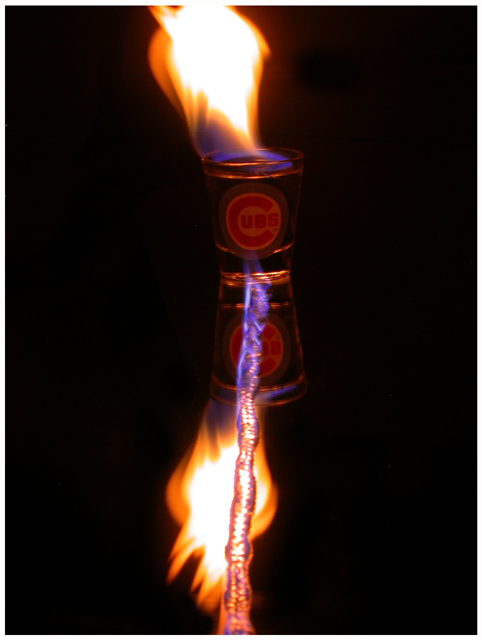
Hi greetings from the CC, here's my thoughts on this image, firstly I think it is a bit too centrally positioned, making for a fairly dull compostion, moving it over to the right with a bigger frame (meaning black space) would probably have helped some. I also find the object on fire (string?) almost too prominant as do I find the label on the bottle distracting. The idea is not a bad one here, the black bckgrnd. works very well, would of liked to have seen a bit more room at top not cutting off the 'flame' esp cuz its the challenge topic. I would also to be curious to see how image would look if rotated it so that the bottle looked as if it were lying on its side and then of course cropped so side of bottle looked like the it was on a table or at least the bottom of image. just some ideas, keep shooting!
lynn |





 Add photograph to your favorites
 Add photographer to your favorites


