| Author | Thread |
Comments Made During the Challenge  |
|
|
01/08/2008 03:18:01 PM |
|
Would have been scored higher if cropped more from left side. Subject is too centered. Wouldn't take much off, just a bit from left side. Hot spots on face are distracting. Love the flare at the base of the sword. |
|
|
|
01/08/2008 01:29:12 PM |
|
|
|
01/07/2008 07:32:23 PM |
|
|
|
01/05/2008 09:41:18 AM |
|
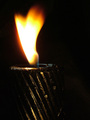
the fire kind of looks like an afterthought |
|
|
|
01/04/2008 11:04:56 PM |
|
I like the idea (not just fire like in many other entries :), but I think execution can be improved: maybe shallow depth of filed to separate from background, or even different background to make fire "more visible"; lighting of her face can be better |
|
|
|
01/04/2008 04:15:10 PM |
|
|
|
01/04/2008 03:06:27 PM |
|
Very cool idea. A bit too bright in a few places. |
|
|
|
01/04/2008 11:30:57 AM |
|
I like the flaming sword, but not sure a pretty girl assasin and shiny leaves go with the concept very well. Seems to dampen the drama. |
|
|
|
01/03/2008 06:03:07 PM |
|
Lighting is a little harsh on her skin and the sword. |
|
|
|
01/03/2008 07:46:31 AM |
|
It's a good idea, but to do it in bright daylight wasn't a good move. A much darker and less distracting background would have improved this a great deal. |
|
|
|
01/02/2008 02:57:41 PM |
|
I would have liked a different crop or angle to this. It feels too much like a snapshot. Also, the glare off the sword is a little bit distracting. But besides that this is a great picture. The fire looks great! |
|
|
|
01/02/2008 01:24:19 PM |
|
i think the concept is poor somehow |
|
|
|
01/02/2008 09:40:33 AM |
|
The glare on the blade on too strong. |
|
|
|
01/02/2008 09:15:15 AM |
|
good idea. light is a little hot on the models face though. |
|
|
|
01/02/2008 07:09:04 AM |
|
I love the fact that you actually worked to set up a shot and make it work. As you can probably tell your lighting is a little harsh, but that is ok. The refelection off the sword is a bit distracting. I think you did fit the assignment. |
|
|
|
01/02/2008 02:41:27 AM |
|
This is a cool shot. I like the composition. I wish there wasn't so much light on the sword so we could focus on the flame. |
|
|
|
01/02/2008 12:13:34 AM |
|
Interesting photo. The glare of the sword is a little distracting and the flame is hidden due to the background. |
|
Home -
Challenges -
Community -
League -
Photos -
Cameras -
Lenses -
Learn -
Help -
Terms of Use -
Privacy -
Top ^
DPChallenge, and website content and design, Copyright © 2001-2026 Challenging Technologies, LLC.
All digital photo copyrights belong to the photographers and may not be used without permission.
Current Server Time: 07/01/2026 05:28:52 PM EDT.