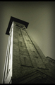
The tonalities on the right half of this image are fantastic. To my eye there's too much of the very flat-lit wall on the left; it is the least interesting part of the image and it is almost dominant. I also think it would work better if you had set it up so the converging verticals were symmetrical; lining up the right edge vertically has leaned everything else over badly to the right and it's an unnatural way of seeing. On the other hand, this IS the perspective challenge, so perhaps the unnatural perspective was your goal?






 Add photograph to your favorites
 Add photographer to your favorites

 Photographer found comment helpful.


