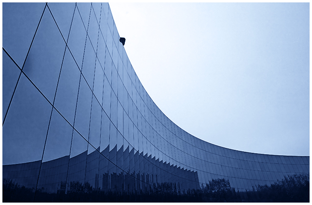
I like the lines created by the building at lot- This one has a great deal of coolness to it. I almost think that reorienting the image so that the curve starts in the corner might help. The other thing that slightly affects this is some apparent oversharpening on the windows.
The reflection of the other building really screams to be emphasized more - i think wardmac had a good idea for recropping.
If this were mine, I'd remove the head (or whatever it is) up at the top. I love the smoothness of this image and the clean lines and gradient color. The head just breaks it up for me.






 Add photograph to your favorites
 Add photographer to your favorites


 Photographer found comment helpful.


