| Author | Thread |
|
|
12/31/2007 08:07:32 AM |
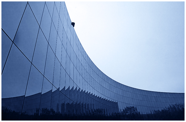
I like the lines created by the building at lot- This one has a great deal of coolness to it. I almost think that reorienting the image so that the curve starts in the corner might help. The other thing that slightly affects this is some apparent oversharpening on the windows.
The reflection of the other building really screams to be emphasized more - i think  wardmac had a good idea for recropping. wardmac had a good idea for recropping. |
|
 Photographer found comment helpful. Photographer found comment helpful. |
Comments Made During the Challenge  |
|
|
12/29/2007 09:54:48 PM |
|
I would cut the right 1/3 out of this leaving more attention to the jagged shapes on the windows. |
|
| Photographer found comment helpful. |
|
|
12/29/2007 04:24:08 PM |
|
If this were mine, I'd remove the head (or whatever it is) up at the top. I love the smoothness of this image and the clean lines and gradient color. The head just breaks it up for me. |
|
| Photographer found comment helpful. |
|
|
12/24/2007 06:56:13 PM |
|
Just lacking that little bit of interest to make this more attractive , possibly more dramatic cloudscapes - 6 |
|
| Photographer found comment helpful. |
|
|
12/24/2007 03:25:01 AM |
|
| Photographer found comment helpful. |
|
|
12/24/2007 02:32:41 AM |
|
Interesting image: appears somewhat oversharpened because all the lines at the window panes are jagged. Nice control of light and shadow. |
|
| Photographer found comment helpful. |
|
|
12/24/2007 12:39:20 AM |
|
I would have cropped the below the thing sticking out of the top of the building.. love the reflection |
|
| Photographer found comment helpful. |
Home -
Challenges -
Community -
League -
Photos -
Cameras -
Lenses -
Learn -
Help -
Terms of Use -
Privacy -
Top ^
DPChallenge, and website content and design, Copyright © 2001-2026 Challenging Technologies, LLC.
All digital photo copyrights belong to the photographers and may not be used without permission.
Current Server Time: 07/01/2026 04:25:05 PM EDT.