| Author | Thread |
|
|
01/07/2008 12:40:53 PM |
|
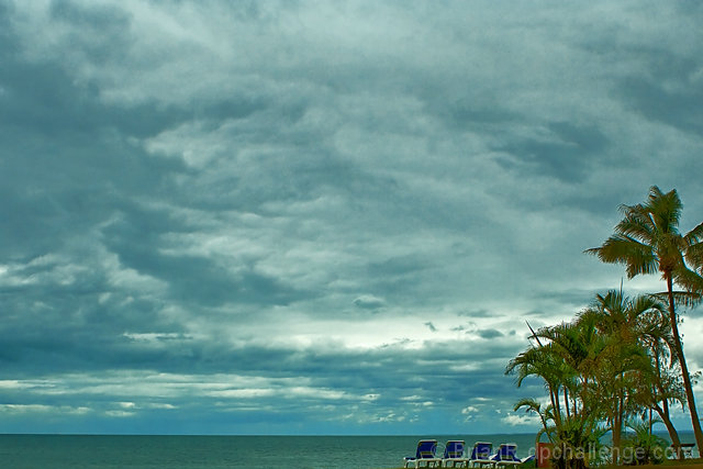
Conceptually this is very nice, if a bit off the beaten path for a "perspective" challenge. The cropping on the bottom and right is simply excellent. The processing, unfortunately, is a whole other story. It's got an overall muddy, green tint to it that is damaging you. I see you are using lightroom, which is an excellent color management tool, so it makes me wonder if the color is set right on your monitor. Aside from color and noise issues, this is a very nice image. |
|
|
|
01/02/2008 12:48:47 PM |
|
Very simple very well done,. Not sure why it scored as low as it did. Maybe a bit too much in the blue channel, but not much. Personally I think the photo is a winner. |
|
 Photographer found comment helpful. Photographer found comment helpful. |
Comments Made During the Challenge  |
|
|
12/30/2007 03:29:17 PM |
|
a wee bit too much of the sky, i preffer when it takes 2/3 instead of 4/5 |
|
| Photographer found comment helpful. |
|
|
12/29/2007 04:33:20 PM |
|
Interesting and very effective. Breaks the rule of thirds with the horizon, yet still adheres to it with the placement of the trees. Not sure how this straight across composition illustrates perspective, but I really like the image. |
|
| Photographer found comment helpful. |
|
|
12/27/2007 11:03:09 PM |
|
a bit too much saturation in the cyan. No wow effect either 5 |
|
| Photographer found comment helpful. |
|
|
12/26/2007 03:55:34 AM |
|
Nice idea but I'd like this better if it had just a little bit of forground and maybe some more drama in the sky. |
|
| Photographer found comment helpful. |
|
|
12/25/2007 07:53:23 AM |
|
too much sky , colors could be more vibrant and saturated - 5 |
|
| Photographer found comment helpful. |
|
|
12/24/2007 07:14:08 AM |
|
seemingly too broad but nice |
|
| Photographer found comment helpful. |
Home -
Challenges -
Community -
League -
Photos -
Cameras -
Lenses -
Learn -
Help -
Terms of Use -
Privacy -
Top ^
DPChallenge, and website content and design, Copyright © 2001-2026 Challenging Technologies, LLC.
All digital photo copyrights belong to the photographers and may not be used without permission.
Current Server Time: 06/30/2026 12:48:50 AM EDT.