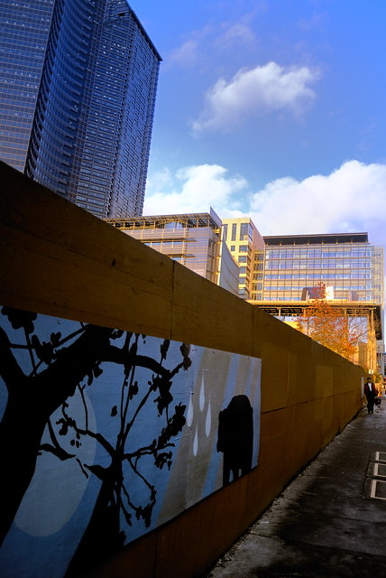
I love this one for the title (how could I not?) but as an image it doesn't engage me at all. Since this is advanced editing, some shadow/highlight work or tone mapping could have accomplished wonders in bringing up the fence to the prominence it deserves. As it is submitted, the bear is not carrying the metaphorical weight he ought to be. I also think it's cropped just too danged tight on the right, really squeezing that figure into oblivion.
I really like this, Jason. I like the composition, but most of all I like the light and colors -- the blues and yellows of the buildings echoed in the painting. And the black of the man's coat balancing the black in the painting. I gave this a 9.
P.S. If this were mine, I would remove the three bright things in the sidewalk.
I feel that this is a great shot but the leaning tower is a distraction for me. I think that if you had done a top horizontal crop so that the wall was a diagonal coming off the top left corner, much more emphasis would have been placed on the perspective and the beautiful mural!





 Add photograph to your favorites
 Add photographer to your favorites

 Photographer found comment helpful.


