| Author | Thread |
|
|
05/22/2008 09:32:39 AM |
|
This is a great idea and love the strong composition, colors and the detail very much..... |
|
 Photographer found comment helpful. Photographer found comment helpful. |
Comments Made During the Challenge  |
|
|
12/04/2007 12:00:42 AM |
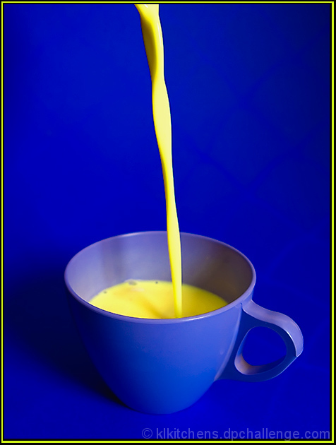
From the description:
...For those of you who need a refresher, your main sets of complementary colors are red/green, blue/orange, yellow/purple.
Sorry, but you didn't get the colors right. |
|
|
|
12/02/2007 07:17:08 PM |
|
The yellow border is a bit much. That yellow is so bright it's making my eyes water. |
|
| Photographer found comment helpful. |
|
|
12/01/2007 08:10:42 AM |
|
Colors and subject are fun; I might have moved the cup off to the side of the composition a bit, or tilted the whole thing just to add a bit more interest to the composition. |
|
| Photographer found comment helpful. |
|
|
11/30/2007 01:40:58 PM |
|
| Photographer found comment helpful. |
|
|
11/29/2007 02:12:42 PM |
|
| Photographer found comment helpful. |
|
|
11/28/2007 08:04:57 PM |
|
oh my goodness! i love it! so clear, so perfect! 9! (would be a ten but i think blue is to go with orange not yellow...) |
|
| Photographer found comment helpful. |
|
|
11/28/2007 12:58:45 PM |
|
Blue and yellow are not complementary colors... |
|
|
|
11/28/2007 12:44:43 PM |
|
I think you you need a higher DOF here. The focus makes the handle the main subject, which is probably not your intention. Very esthetic though. |
|
| Photographer found comment helpful. |
|
|
11/28/2007 11:43:38 AM |
|
I'm not sure I'd drink eggnog that yeloow, lol. But for the photo the tones (yellow _and_ blue)are very nice. |
|
| Photographer found comment helpful. |
|
|
11/28/2007 10:04:35 AM |
|
| Photographer found comment helpful. |
|
|
11/28/2007 06:18:12 AM |
|
looks yellow (not orange) on blue to me |
|
| Photographer found comment helpful. |
|
|
11/28/2007 05:13:37 AM |
|
I don't care for the border much, the yellow line destracts my attention from the photo. which is a good one. |
|
| Photographer found comment helpful. |
|
|
11/28/2007 12:57:07 AM |
|
nice & simple. may be orange juice would have been more suitable? - 6 |
|
| Photographer found comment helpful. |
Home -
Challenges -
Community -
League -
Photos -
Cameras -
Lenses -
Learn -
Help -
Terms of Use -
Privacy -
Top ^
DPChallenge, and website content and design, Copyright © 2001-2026 Challenging Technologies, LLC.
All digital photo copyrights belong to the photographers and may not be used without permission.
Current Server Time: 06/30/2026 08:01:11 PM EDT.