| Author | Thread |
Comments Made During the Challenge  |
|
|
11/20/2007 06:22:07 PM |
Meets Challenge - 2
Technicality - 1
Creativity - 2
Biased Opinion - 1
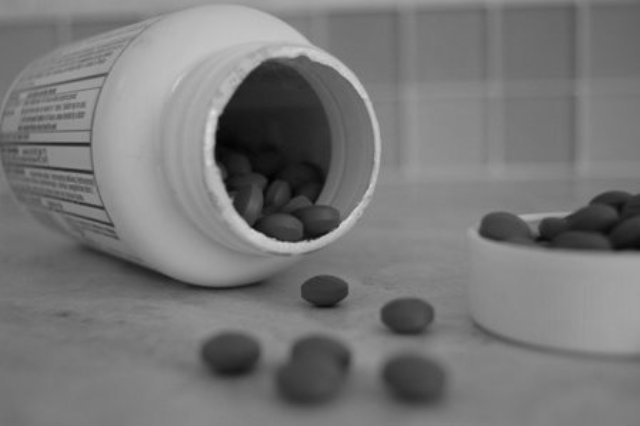
Comment - foreground in focus would help this image |
|
|
|
11/20/2007 04:20:23 PM |
|
Great depth of field. Could have used levels/curves in PS to widen up the tones at the top end to increase the impact, it looks a little dull as it is |
|
|
|
11/20/2007 02:14:44 PM |
|
I'm seeing some lines in the shot that look like it may have been underexposed and brightened later. I like the shallow dof and the overall composition. I do think it could have a bit more contrast though. |
|
|
|
11/20/2007 01:05:41 PM |
|
good idea but this seems to need a bit of levels adjustment |
|
|
|
11/20/2007 09:39:08 AM |
|
This photo is amazing! I love that the top is in it to emphasize topless. I like the out of focus pills in the front because it brings the focus to the bottle. This was just so amazing i voted it a 10! good luck! |
|
|
|
11/19/2007 12:23:51 PM |
|
Great emotion in this photo. |
|
|
|
11/19/2007 02:12:08 AM |
|
nice idea but with the shalllow dof there seems to be a lack of focus in this shot. |
|
|
|
11/19/2007 01:11:00 AM |
|
pills are really fuzzy and distracting upfront, but good idea |
|
|
|
11/18/2007 05:58:14 PM |
|
|
|
11/18/2007 05:56:23 PM |
|
Good title. dirty counter. shoudl boost contrast and lower brightness. 7. |
|
|
|
11/17/2007 11:03:39 PM |
|
the more i look at it the more i like it, prob would have gone 1 point higher were the cap not in it, or at least not filled, just seems out of place that way /7 |
|
|
|
11/16/2007 04:01:10 PM |
|
i get the point but i see the top and not the bottom |
|
|
|
11/16/2007 03:15:43 PM |
|
Pills spilling out the bottle, I think I would have enjoyed more focus and a really harsh contrast here. I believe that would have really made this image stand out and take notice. |
|
|
|
11/16/2007 06:00:09 AM |
|
good idea, good composition and perspective. crop at top and left is quite close. could be much sharper and needs more contrast. |
|
|
|
11/14/2007 06:49:57 PM |
|
Nice play with the title. |
|
|
|
11/14/2007 10:33:09 AM |
|
bw conversion is a bit lacking, no deep blacks, could use more contrast to enhance your message |
|
|
|
11/14/2007 06:27:25 AM |
|
I didn't enter, but this would have been my idea. I like that you did it in black and white - seems more effective, more hopeless that way. |
|
|
|
11/14/2007 02:13:03 AM |
|
Title kind of nullifies the challenge...at least it doesn't help convey it. The blurry pills are distracting. |
|
|
|
11/14/2007 12:11:09 AM |
|
great depth of field, but i think it could use a bump in contrast |
|
Home -
Challenges -
Community -
League -
Photos -
Cameras -
Lenses -
Learn -
Help -
Terms of Use -
Privacy -
Top ^
DPChallenge, and website content and design, Copyright © 2001-2026 Challenging Technologies, LLC.
All digital photo copyrights belong to the photographers and may not be used without permission.
Current Server Time: 06/29/2026 03:00:46 AM EDT.